Fundraising campaign
"WORDS OF HOPE" CAMPAIGN IS REACHING PEOPLE AT THEIR LOWEST BY SHARING THAT THERE IS HOPE AND HELP AVAILABLE.
The Fall Campaign is UGM’s largest annual fundraiser, generating 70%+ of its yearly income. For 3 years, UGM took a bold, new approach with "Words of Hope" by speaking directly to individuals experiencing homelessness instead of focusing solely on donors. The campaign shared powerful stories from those in long-term recovery to engage the community and reach those in need, highlighting UGM’s lasting impact.
Since this was the first time UGM directly addressed individuals experiencing homelessness, shifting from a typical donor-centered message, we needed to balance this approach with the campaign’s primary fundraising goal and generate substantial community support. Additionally, the design had to inspire trust and convey the effectiveness of UGM’s programs in a way that resonated with both groups.
Role
Art direction
Design
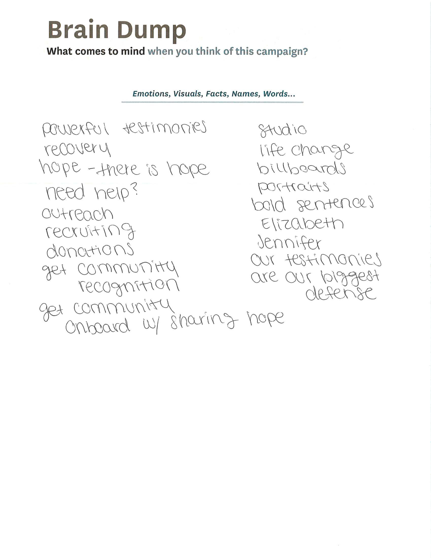
Year 1: Initial Concept Development
Strategy
• Empathetic messaging: Created personal, hopeful messages that resonated with people experiencing homelessness and connected emotionally with the broader community, reinforcing a sense of shared purpose.
• Visual impact: Designed warm, inviting visuals using UGM’s color palette, emphasizing tones symbolizing growth and stability to create an emotive, approachable aesthetic.
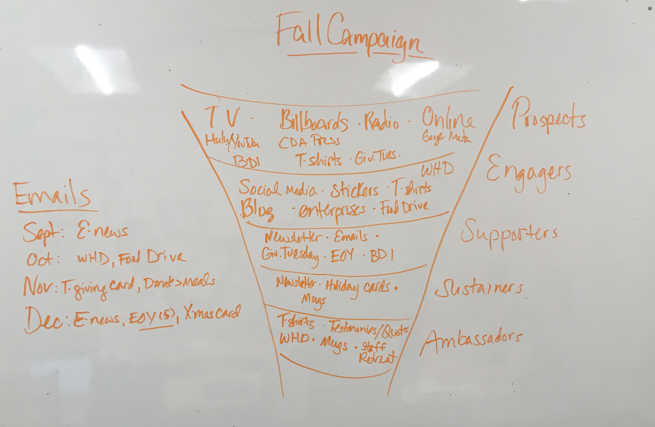
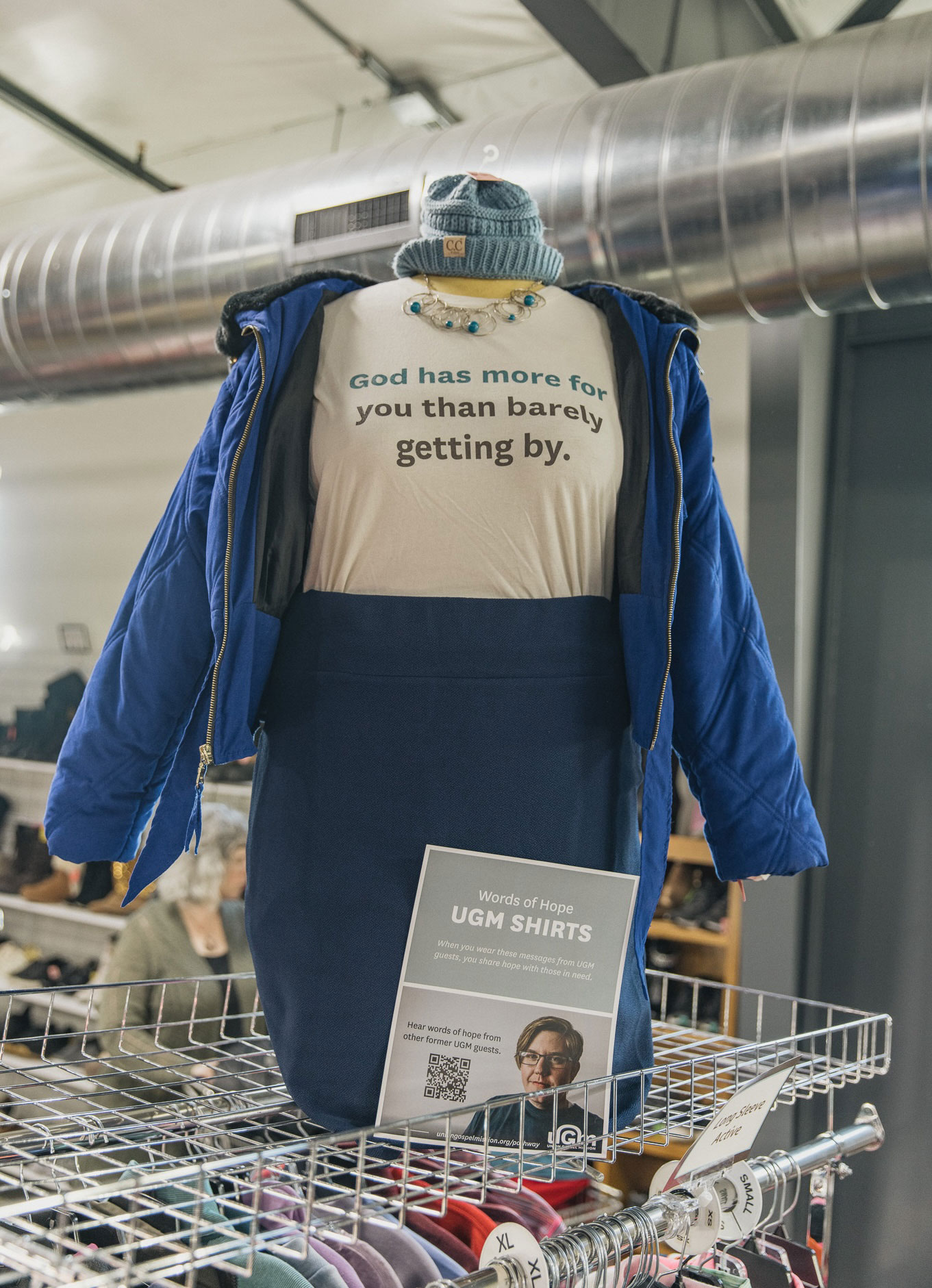
• Donor and community engagement: Developed cohesive materials across multiple touchpoints—including print, digital, and in-person elements—to encourage donations and communicate the campaign’s message of lasting change and hope.
Challenges:
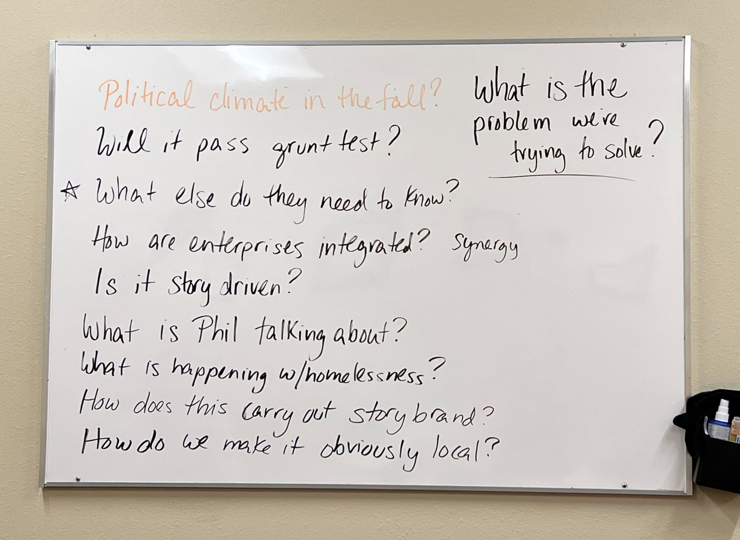
This innovative approach met resistance from leadership due to its risks and deviation from traditional methods. Despite the pushback, the goal was to position UGM as a compassionate and impactful advocate for change.
Year 2: Evaluation and Refinement
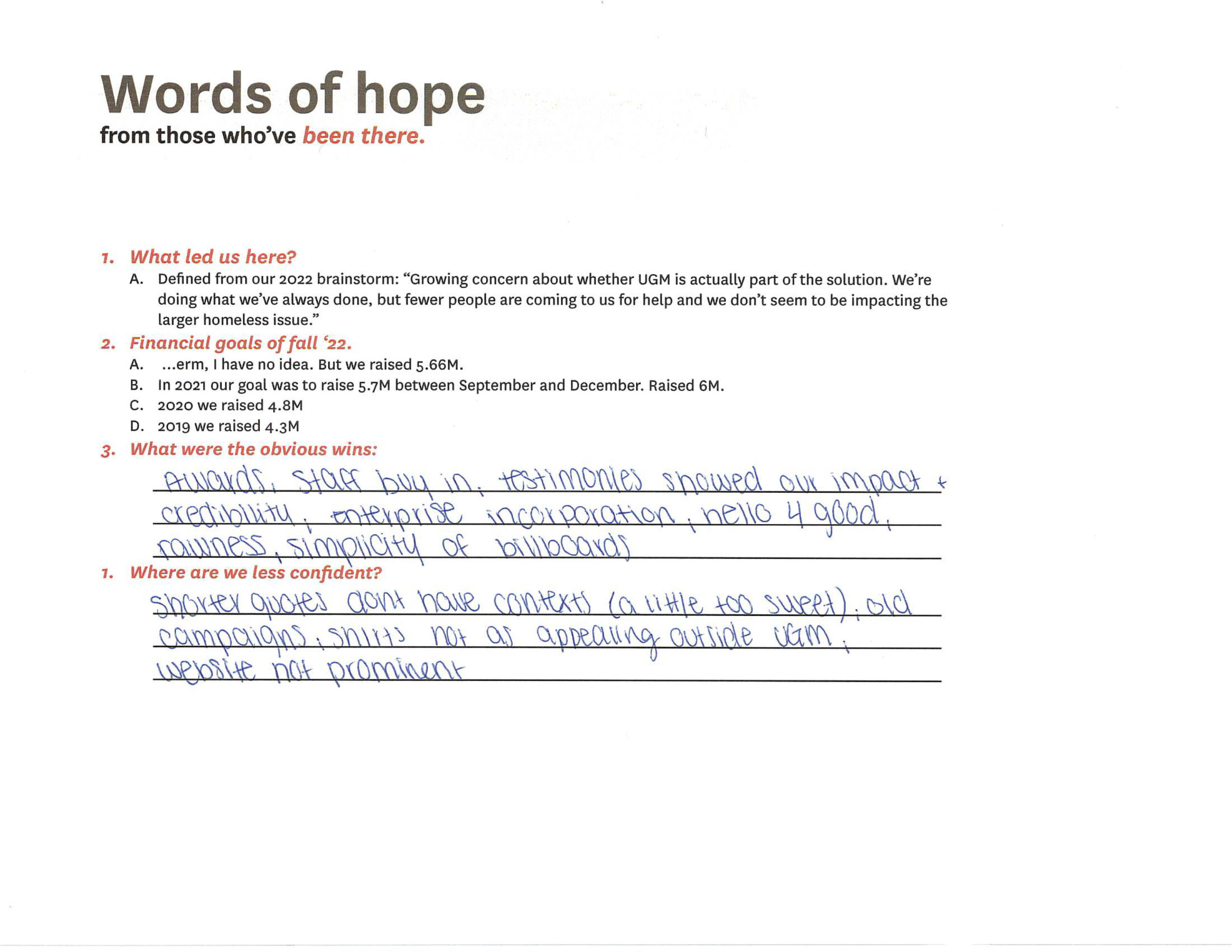
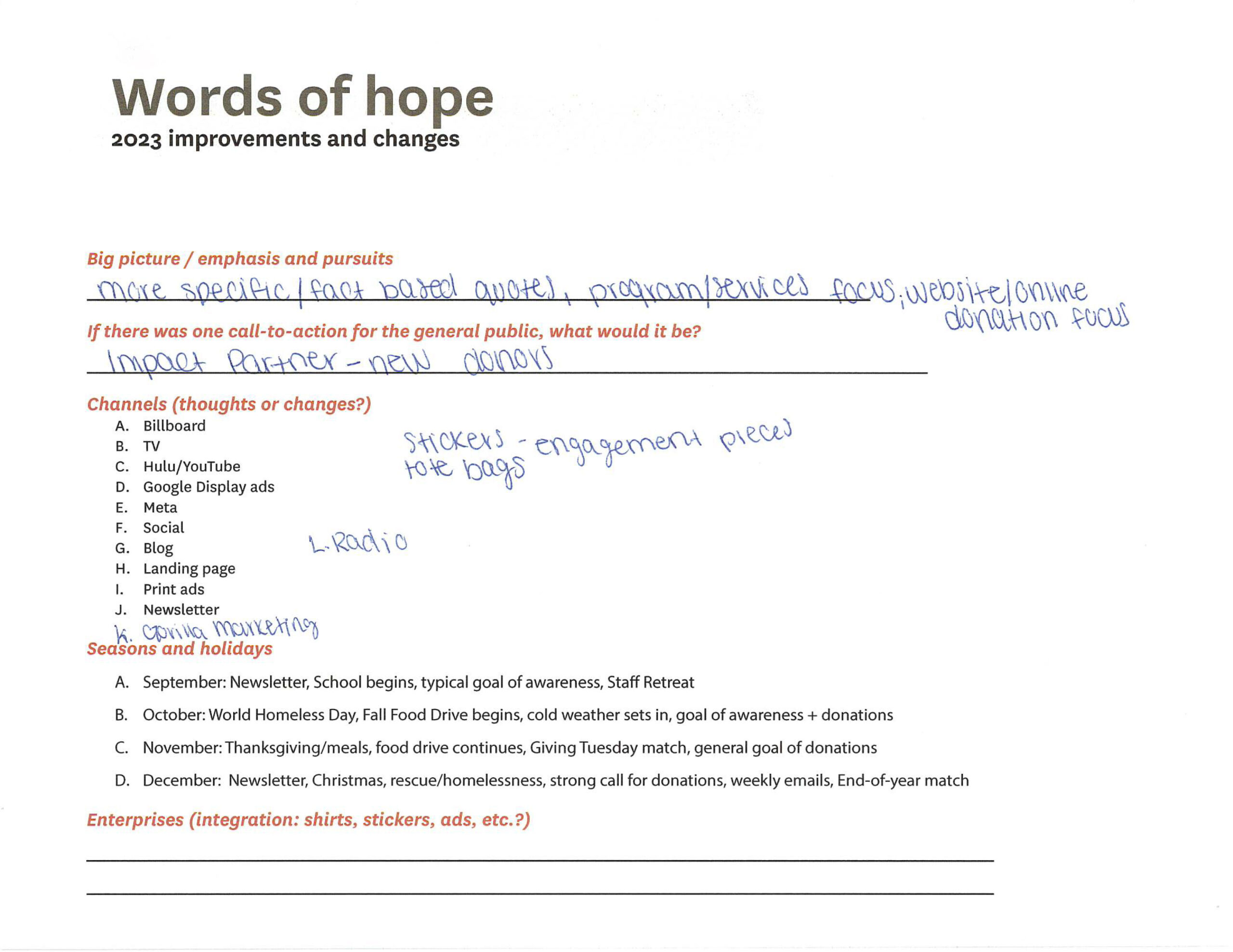
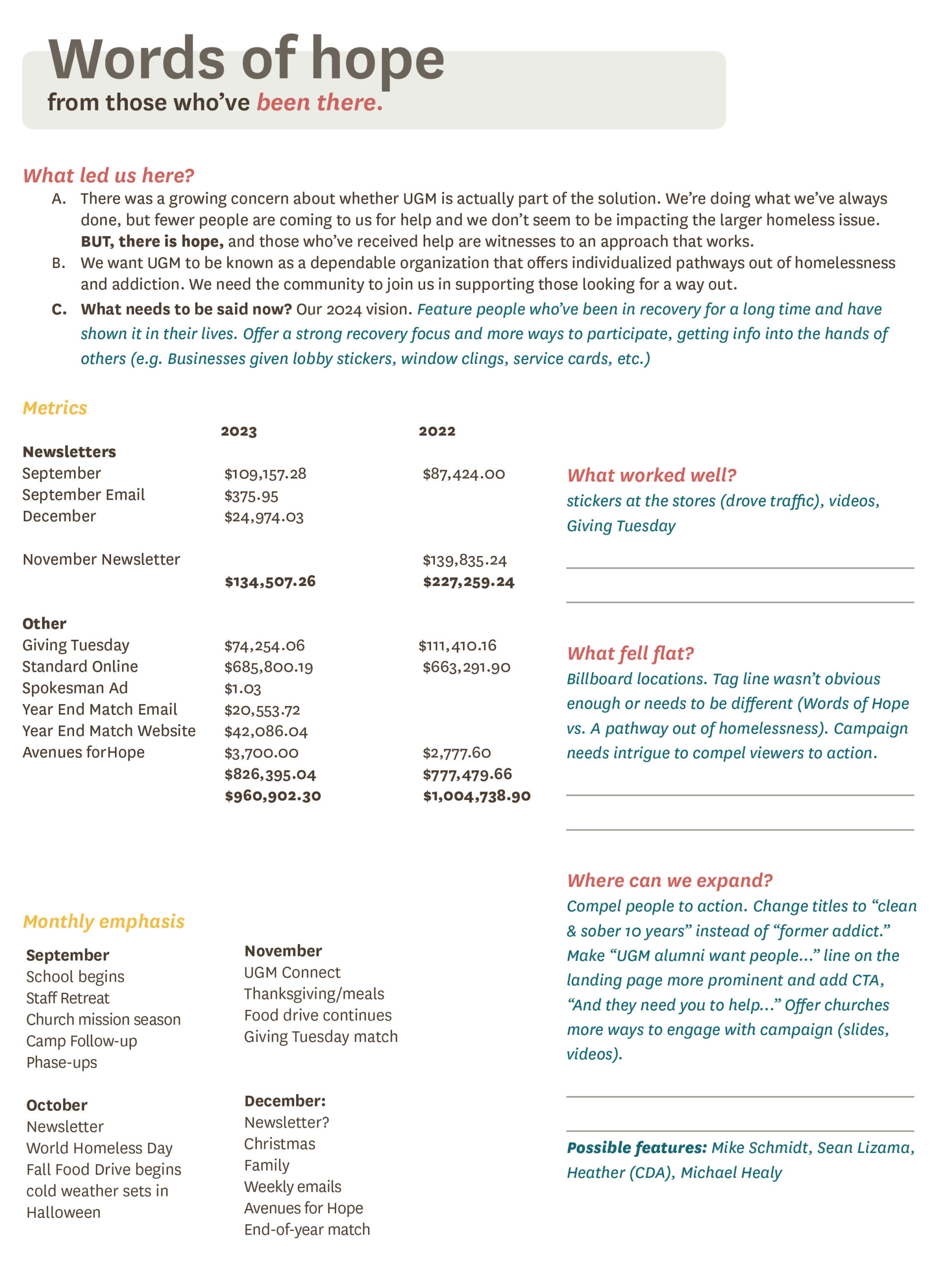
A comprehensive review identified areas for improvement, shifting the focus to specific, fact-based messaging that highlighted UGM’s impact and included clear calls to action.
Insights and adjustments:
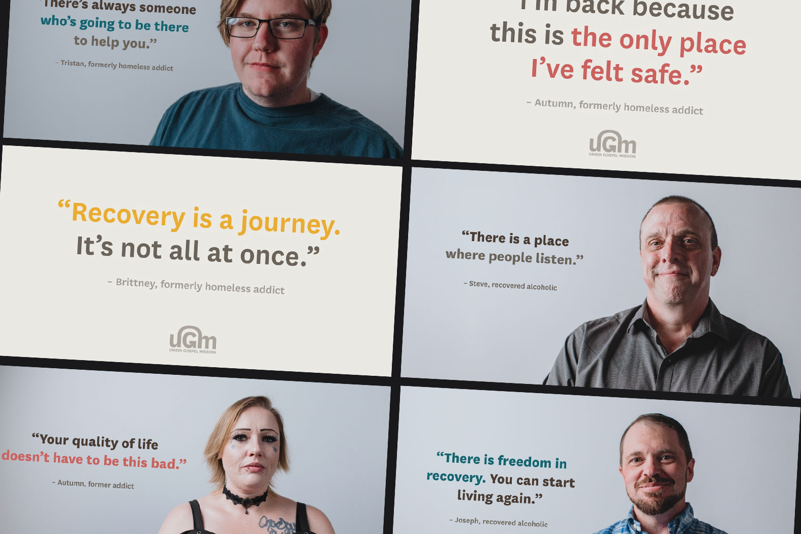
• Quote refinement: Replaced vague statements like "There is hope" with specific quotes emphasizing UGM’s programs and tangible impact.
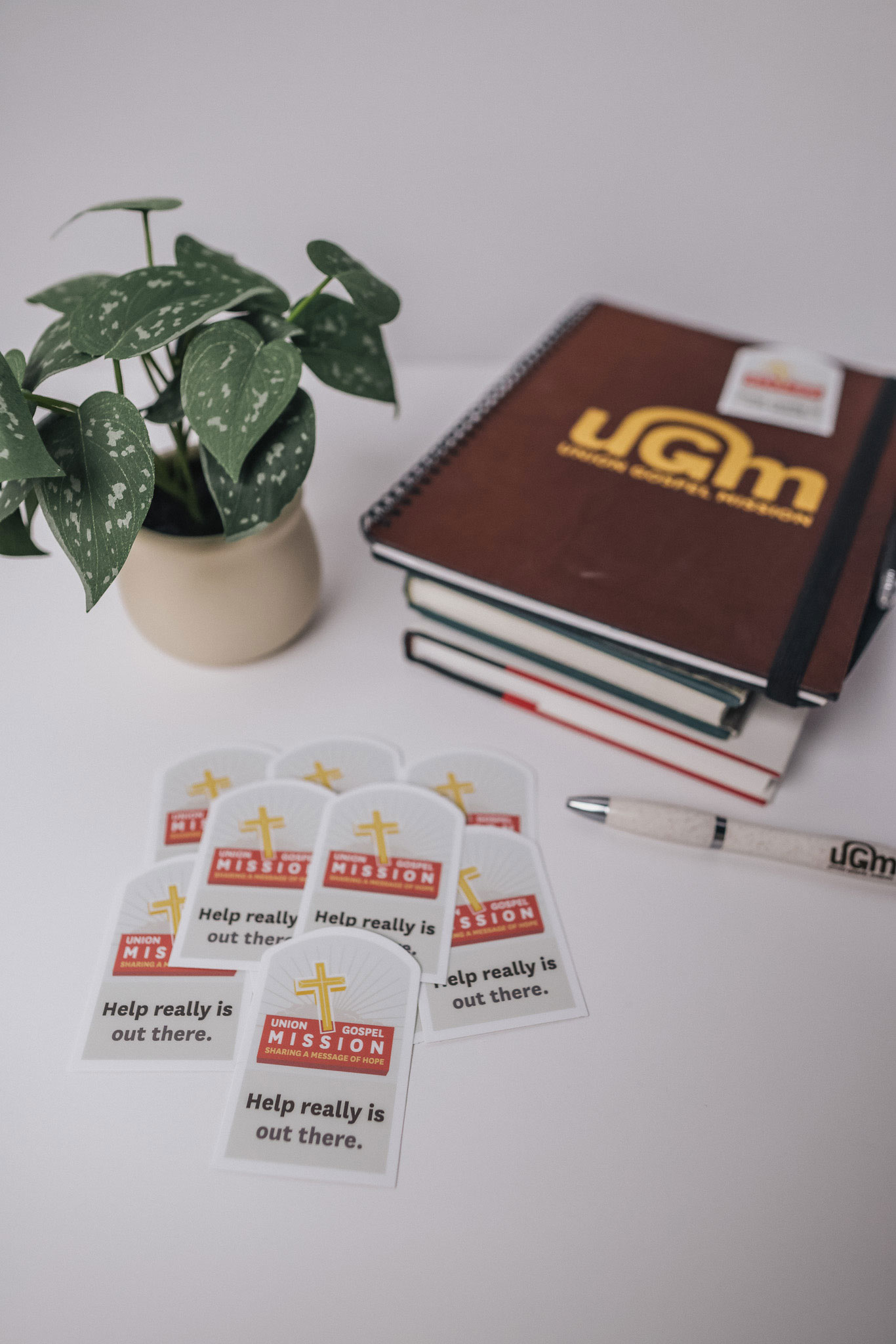
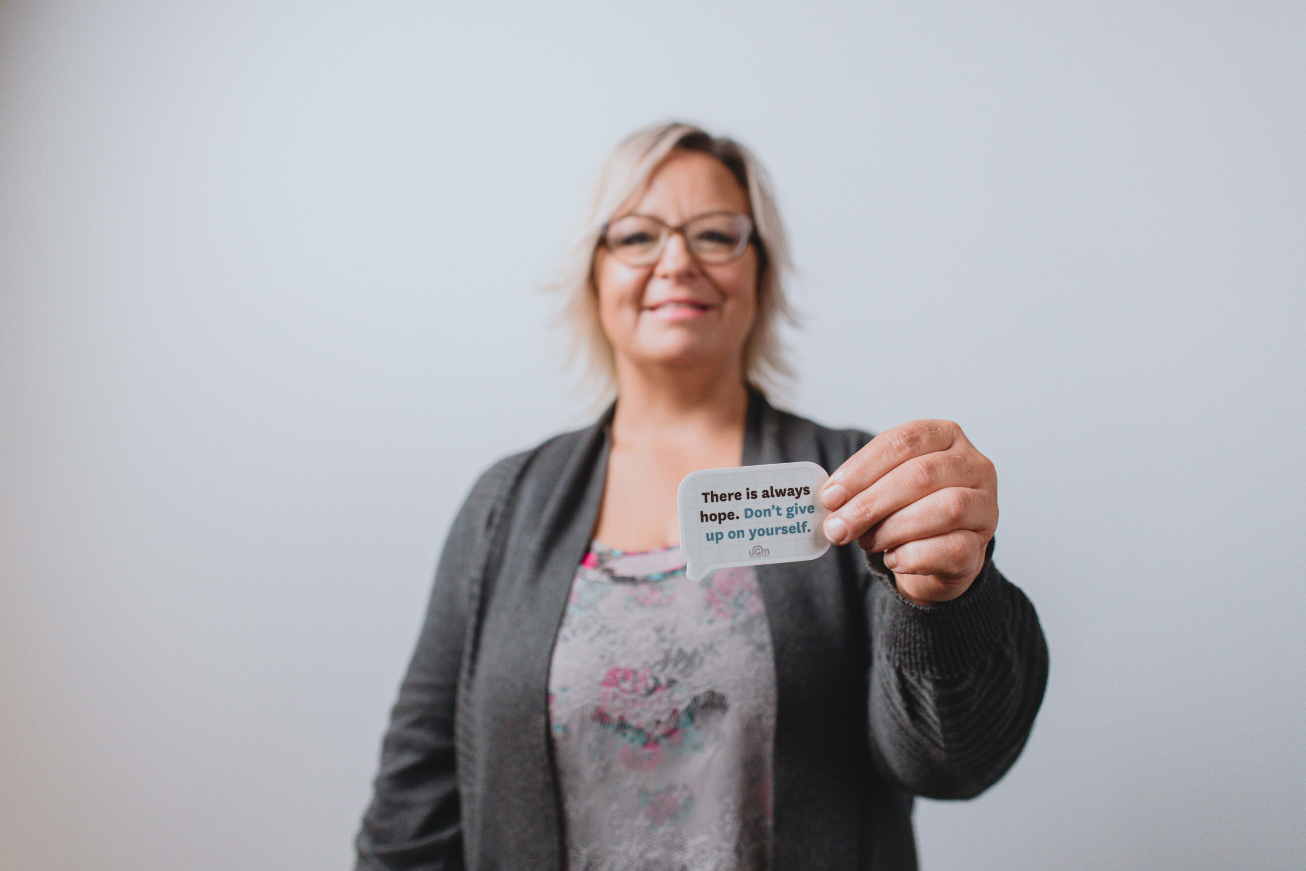
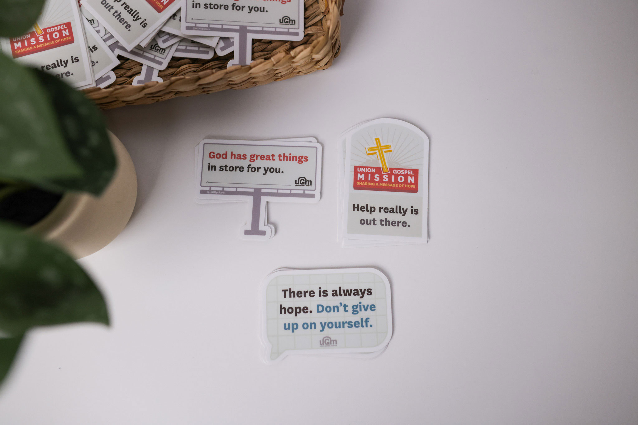
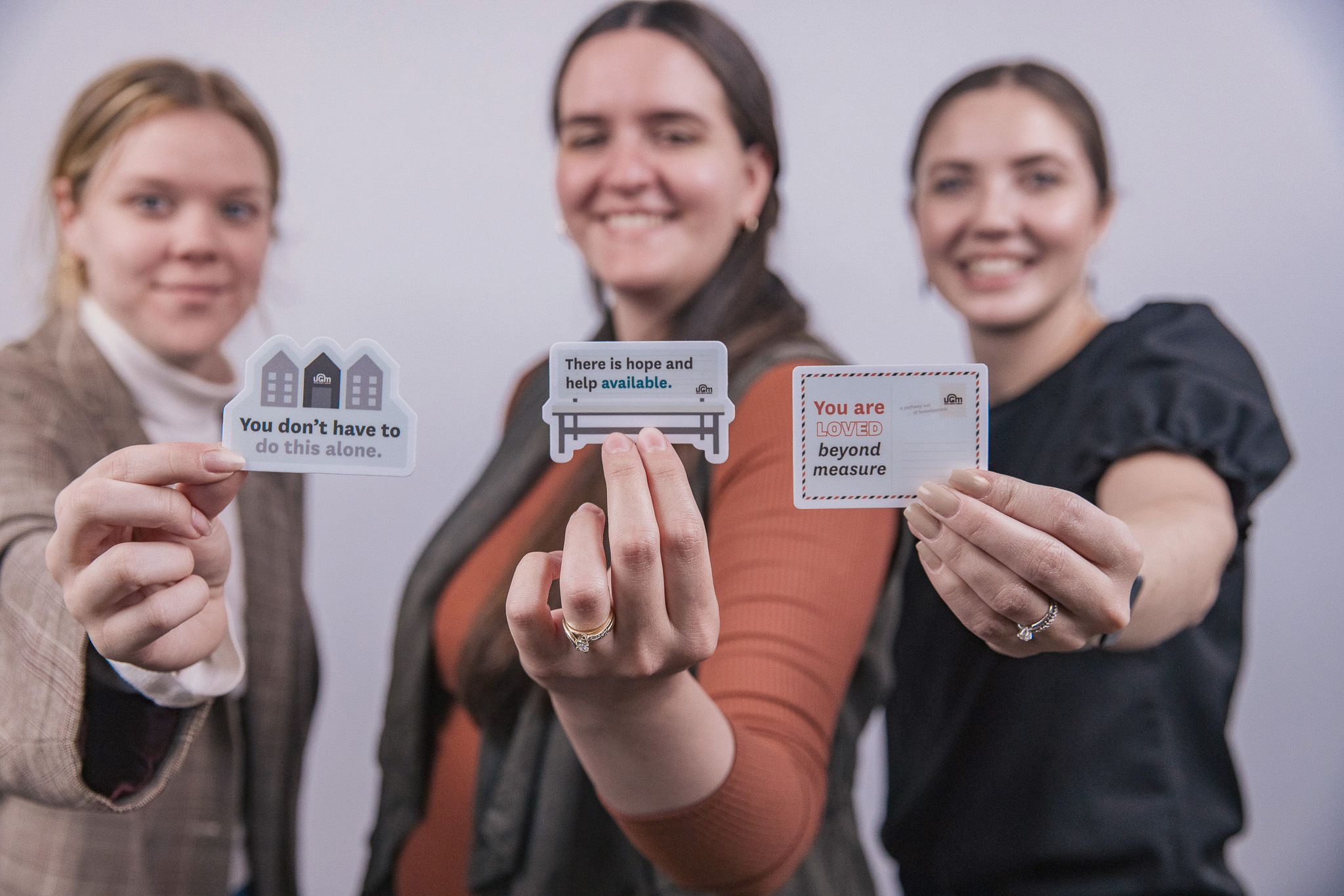
• Audience targeting: Adjusted handouts after discovering "need help" stickers resonated more with donors than those on the streets.
• Website visibility: Enhanced campaign materials with prominent website calls-to-action to drive online engagement and donations.
• Staff support: Strong staff buy-in and testimonials from Year 1 boosted credibility and effectiveness.
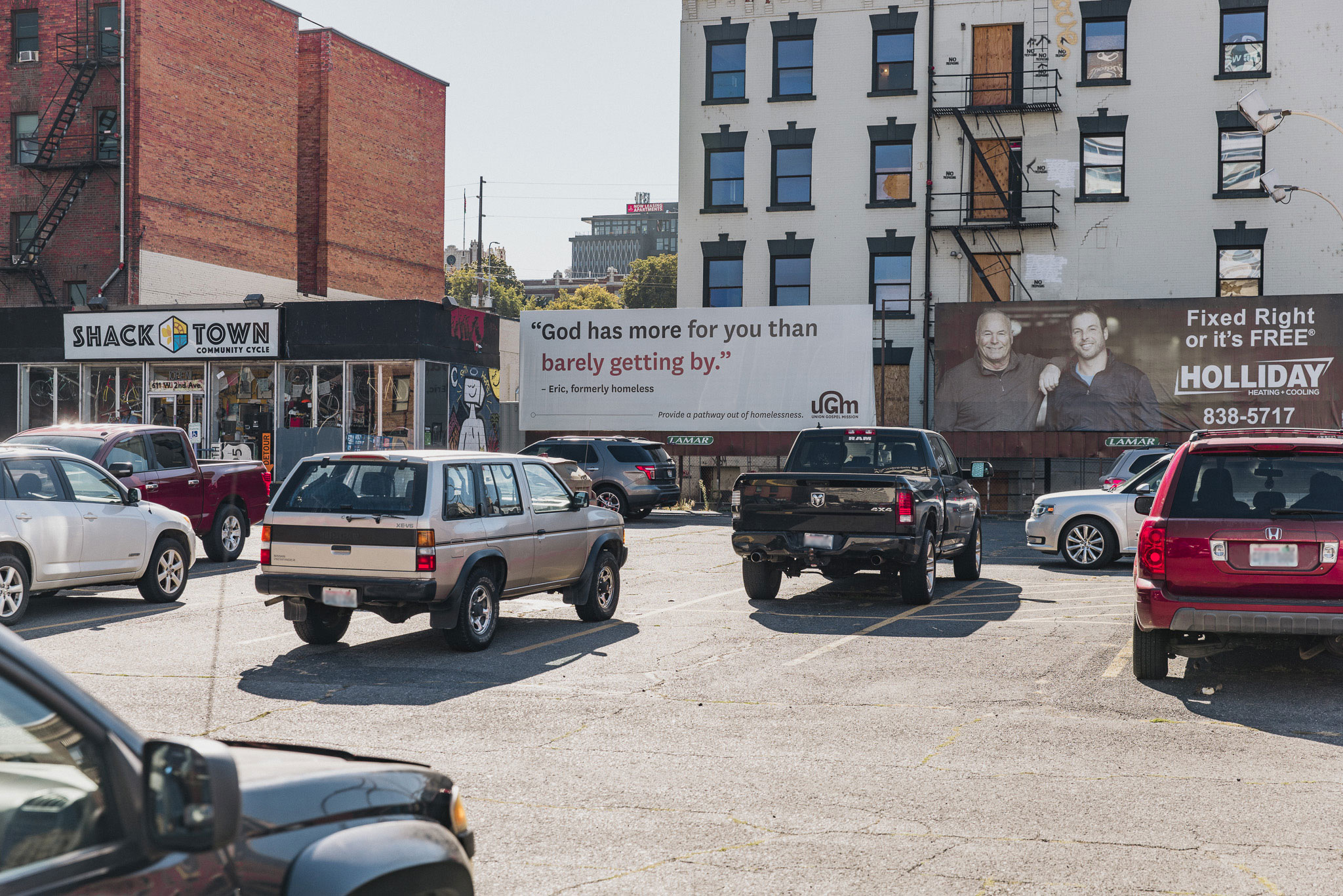
• Visual updates: Simplified and unified billboard designs, adding clearer calls to action and replacing vague quotes with informative messages.
These refinements strengthened the campaign’s clarity, accessibility, and overall impact.
Year 3: Further Evaluation and Strategic Refinement
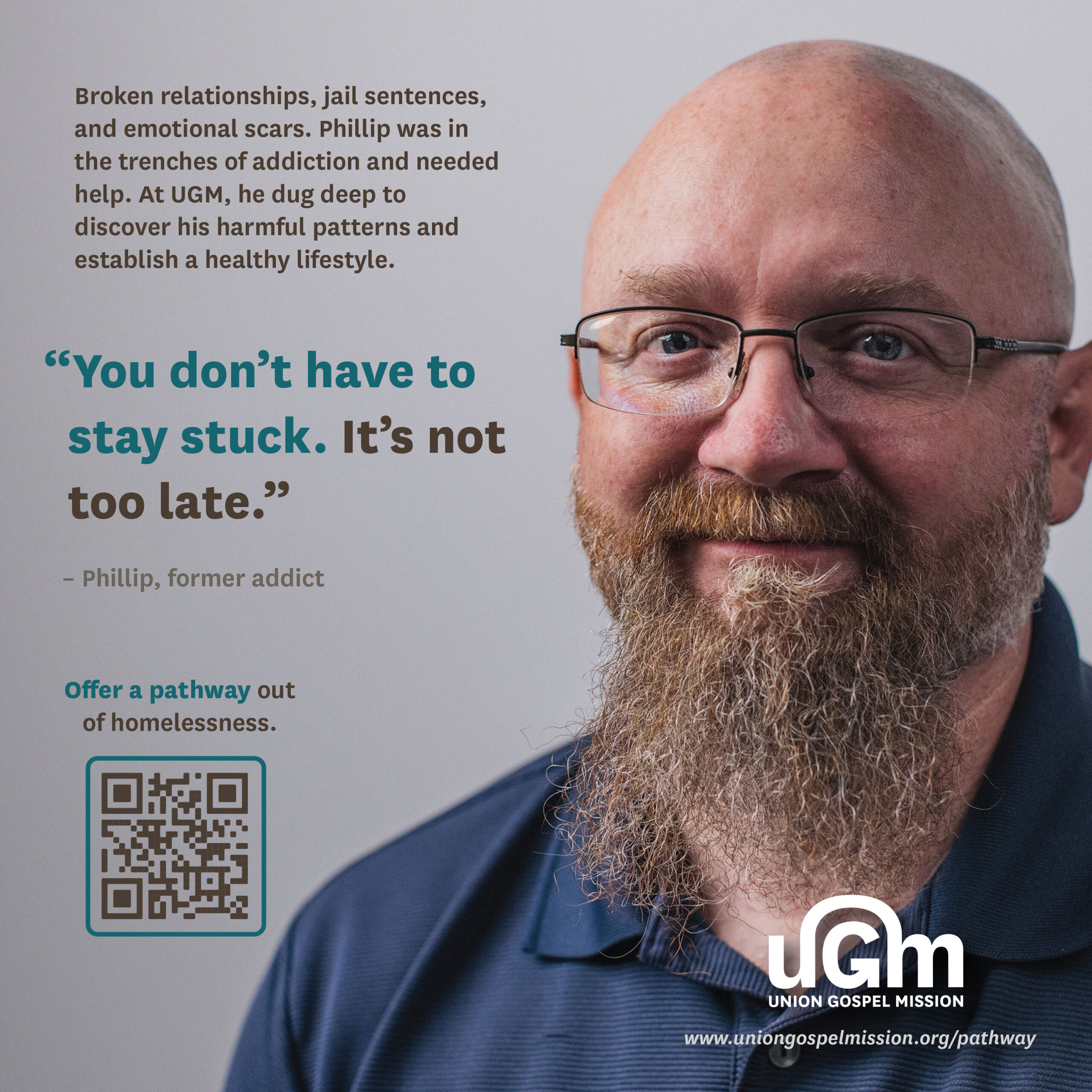
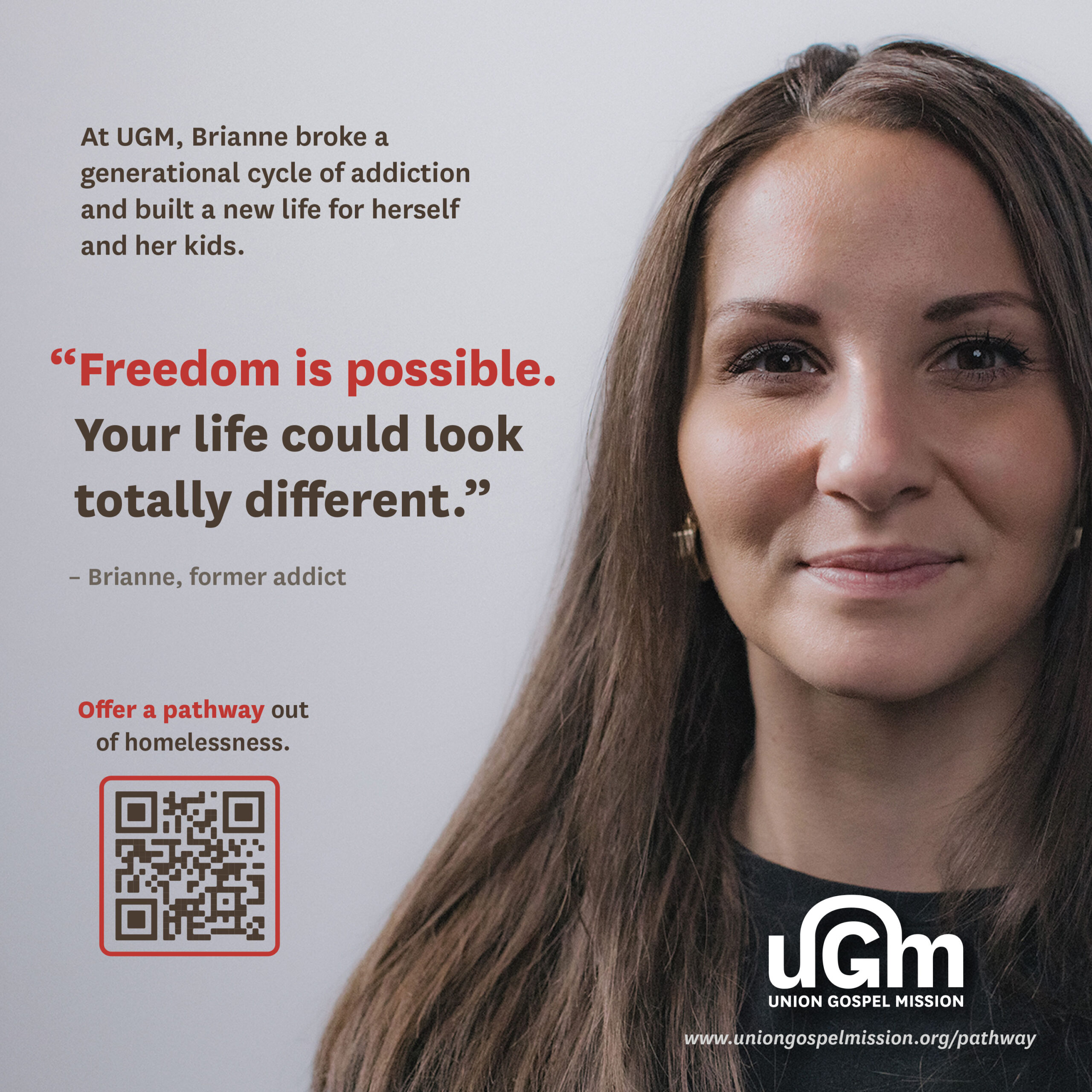
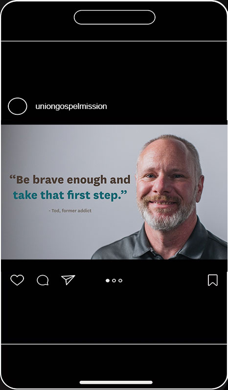
The campaign evolved to spotlight long-term recovery successes, featuring participants’ names and years of sobriety to inspire the community and potential supporters.
Insights & adjustments:
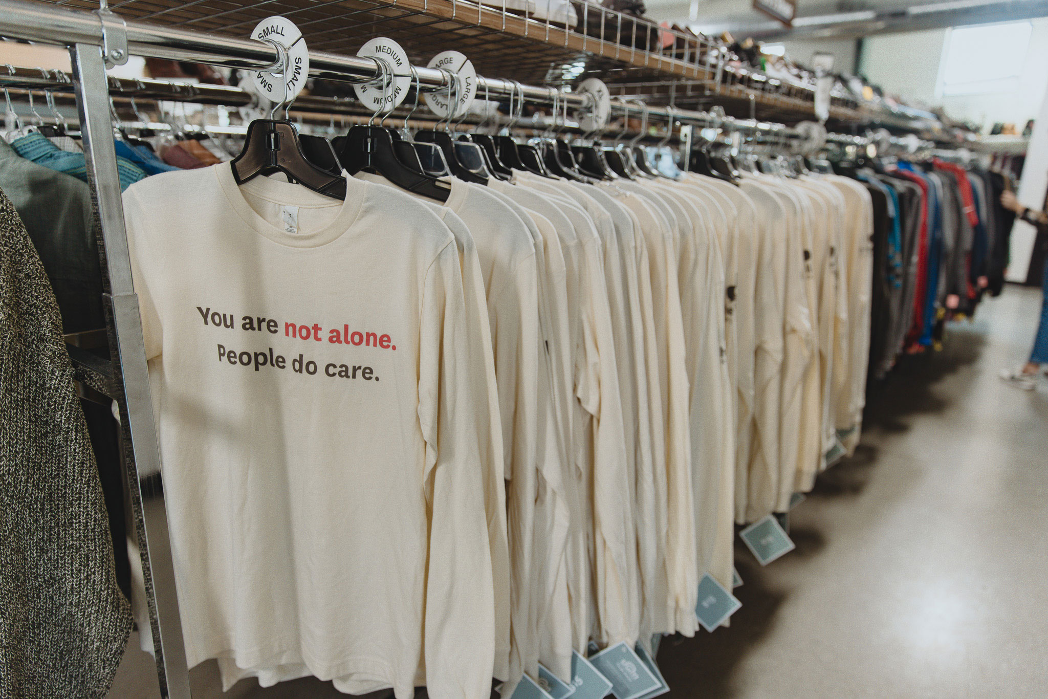
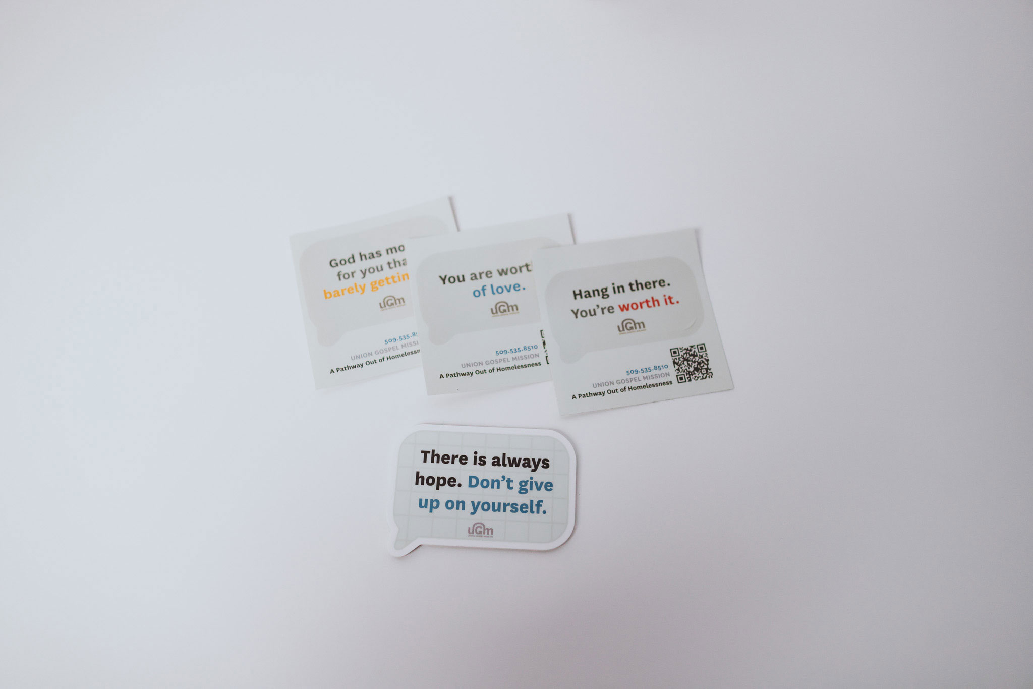
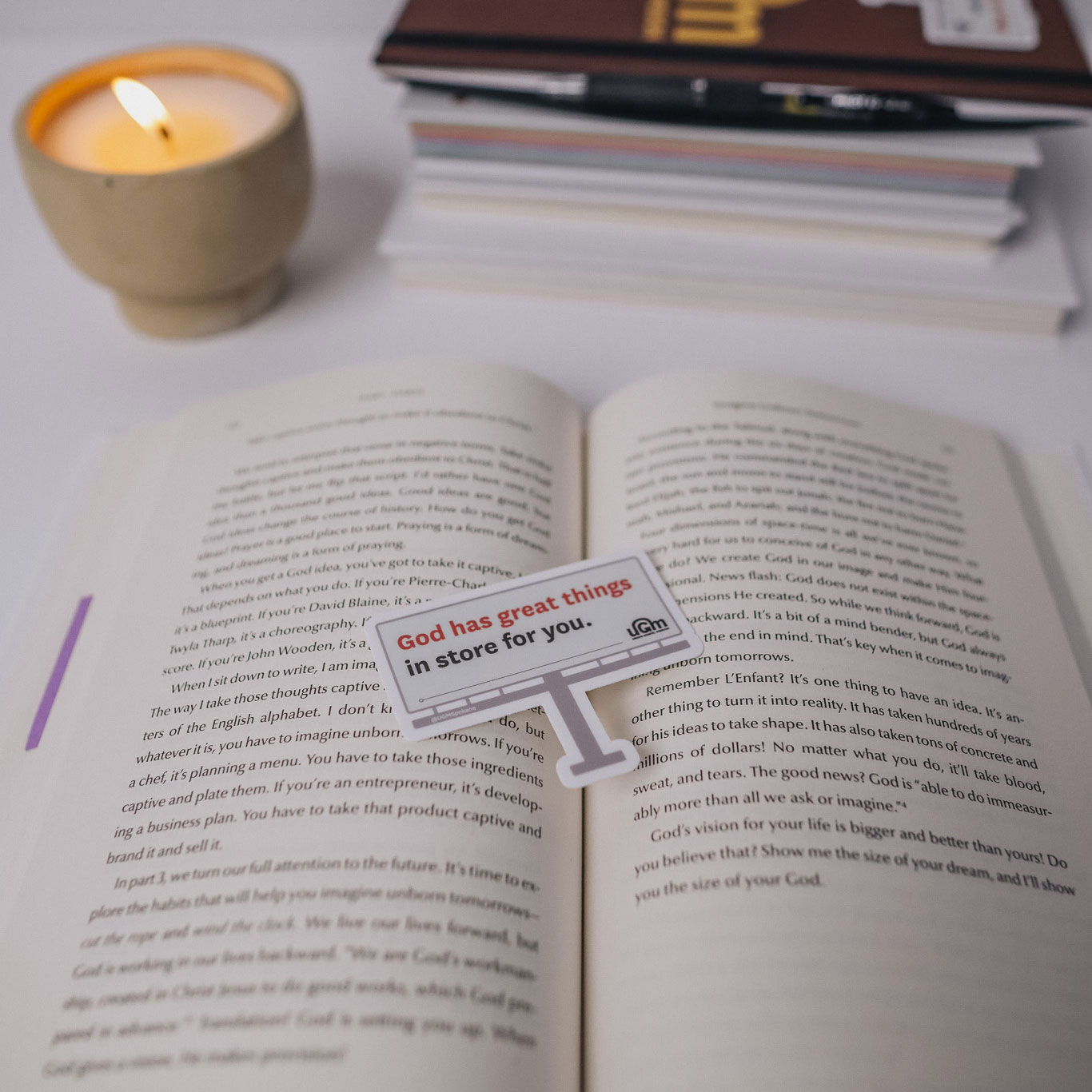
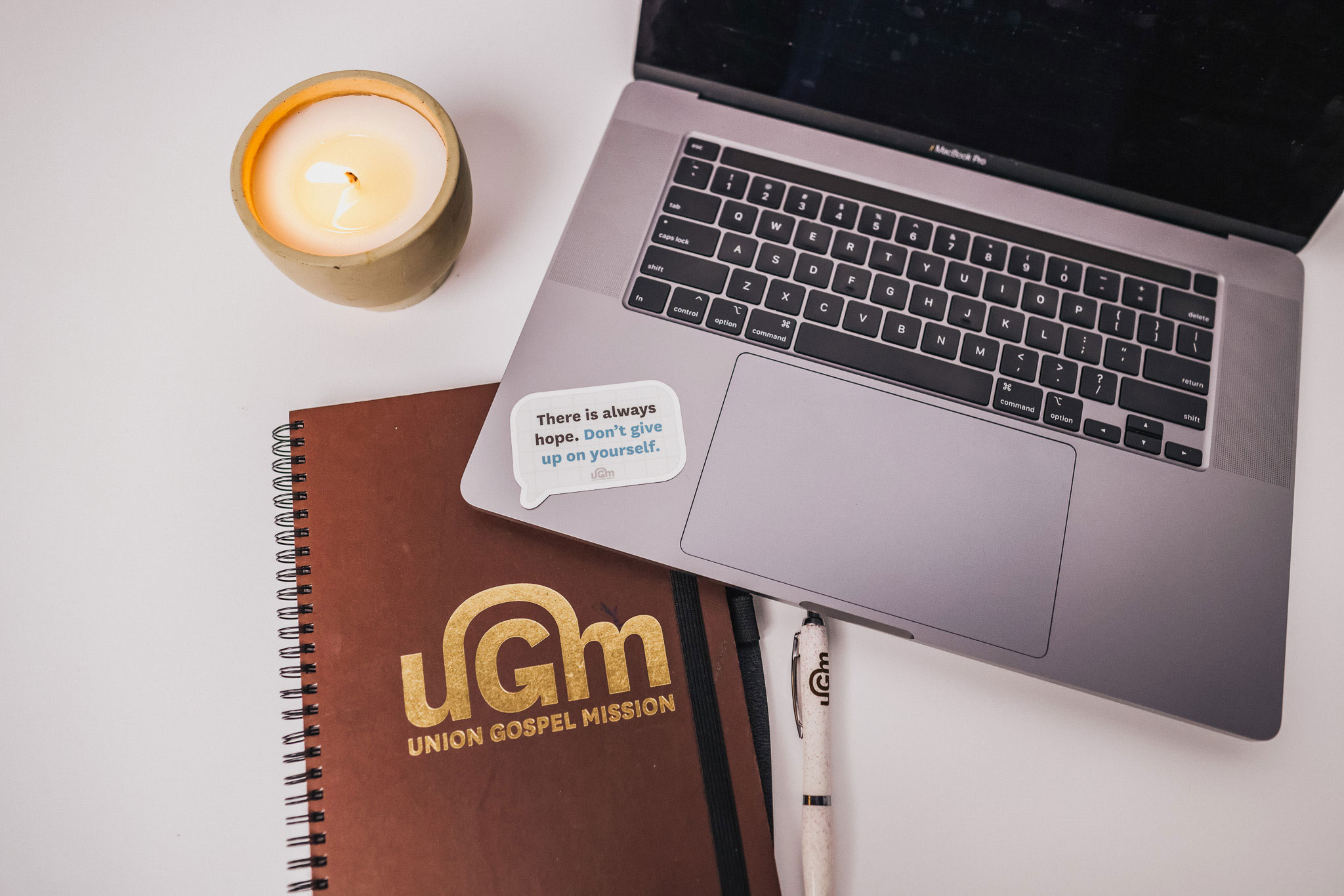
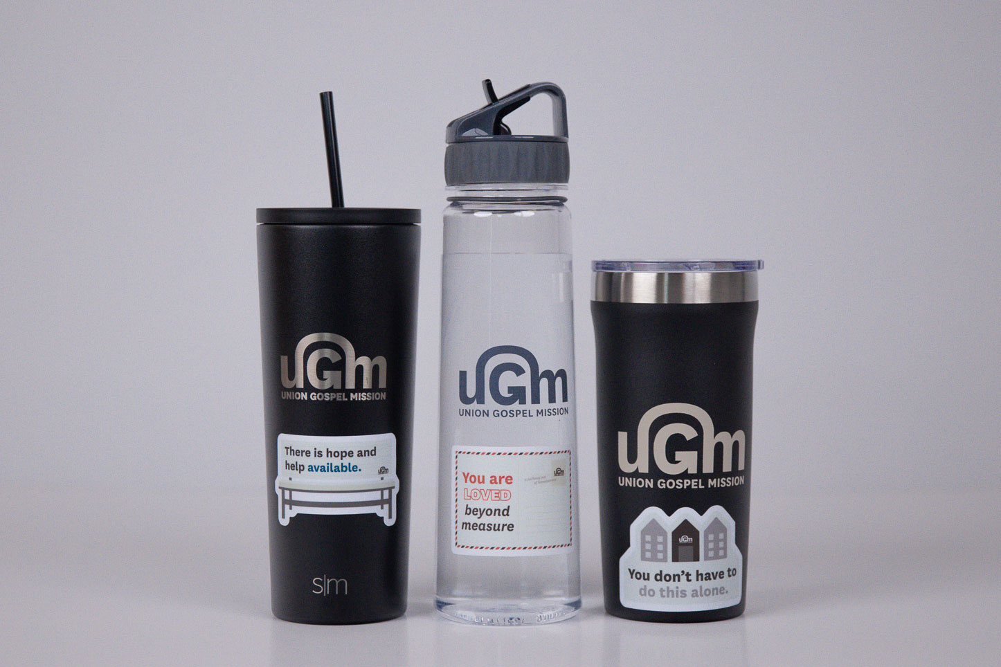
• Sticker success: Stickers gained popularity, boosting visibility through UGM’s enterprises.
• Integrated campaigns: Tied the campaign to UGM events and newsletters for ongoing audience engagement.
• Billboard improvements: Simplified designs with a two-color scheme and larger fonts, addressing visibility issues, though location impact remained limited.
• Bench ads: Introduced bench ads to expand reach and test a new advertising channel.
• Recovery focus: Highlighted participant achievements to celebrate recovery and deepen connection to UGM’s mission.
These refinements sharpened the campaign’s focus, enhanced visibility, and strengthened community engagement.
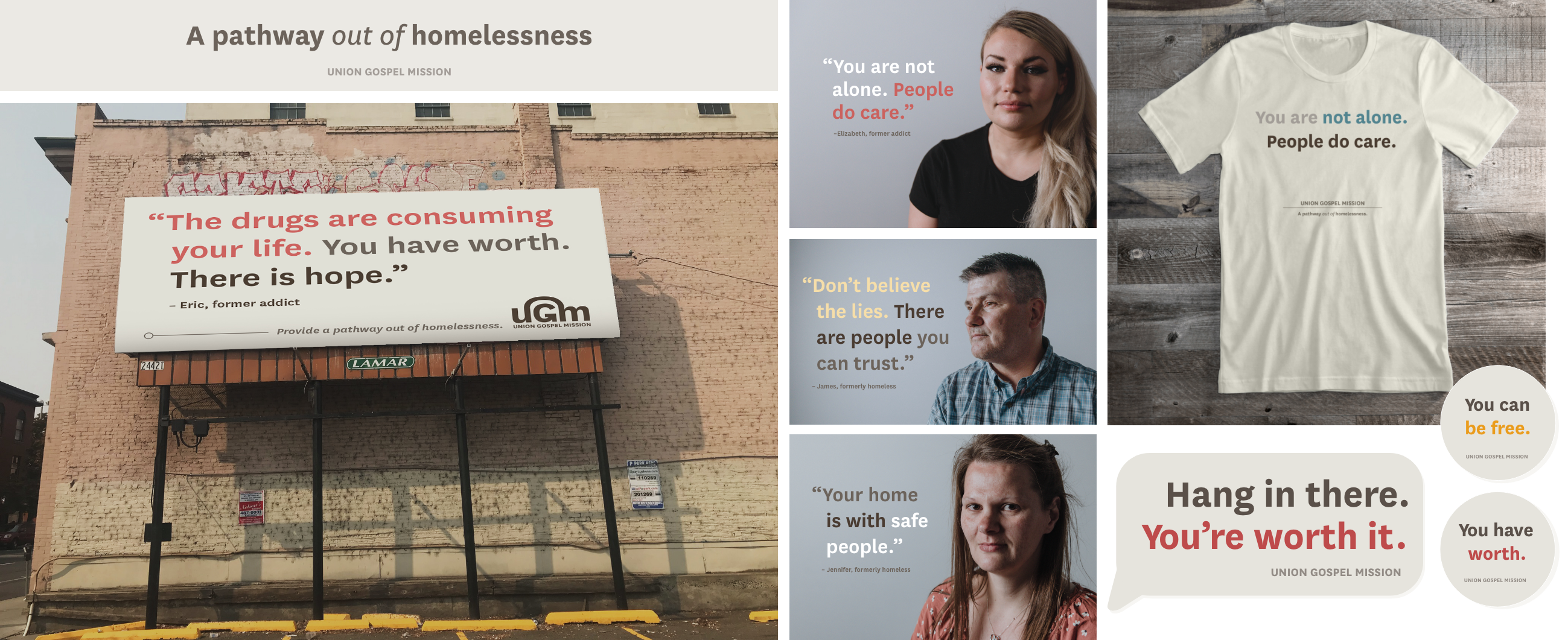
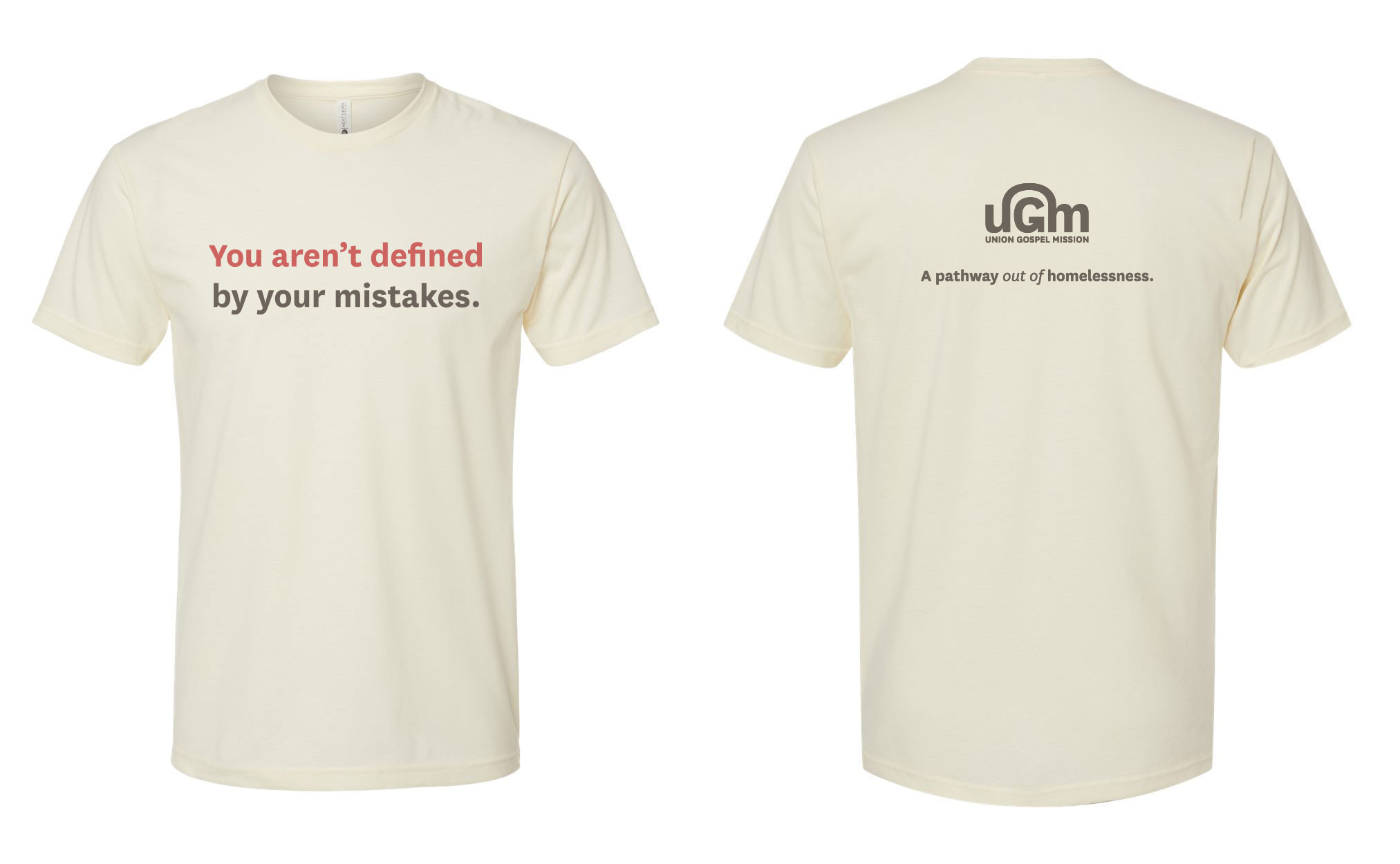
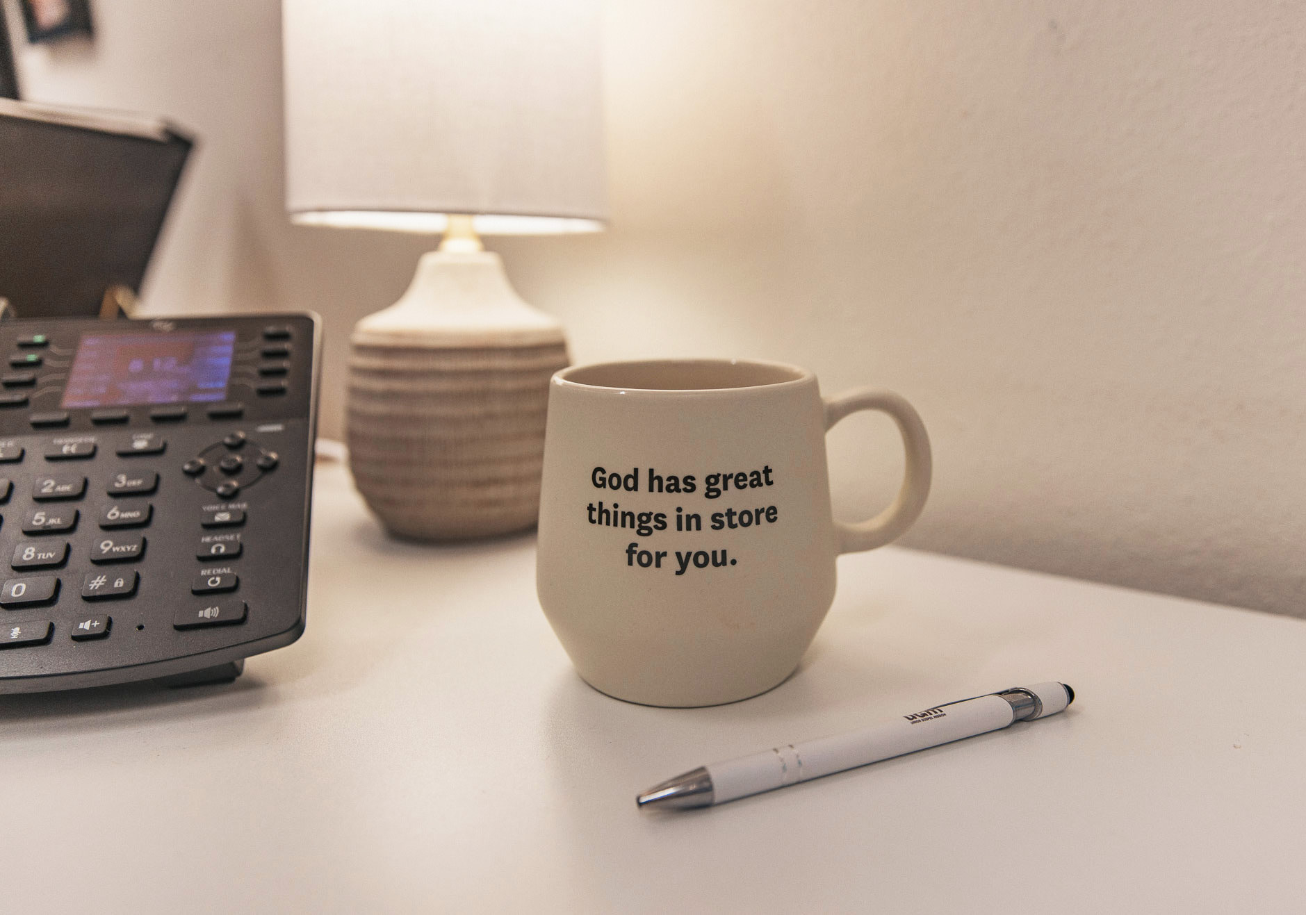
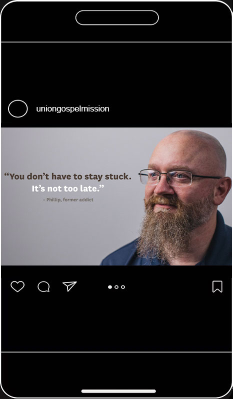
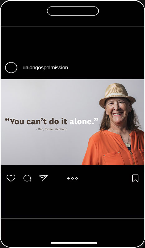
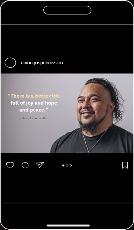
Our creative direction focused on creating a moody, impactful aesthetic. Studio shots featured grey backgrounds with shadows cast across half of each person’s face, adding depth and emotion; some subjects wore smiles, while others held serious expressions, creating a mix of warmth and intensity. Beige served as the campaign’s primary color, acting as a versatile backdrop across all materials. Strong, bold quotes were showcased on billboards, shirts, stickers, and social media posts, with phrases strategically broken into sections and accented with different colors to emphasize key messages and convey a powerful, cohesive brand identity.
Each piece of our campaign pointed to uniongospelmission.org/pathway, which provides a place to donate as well as an inside look into those who have gone through recovery to change their lives.
Impact & outcomes
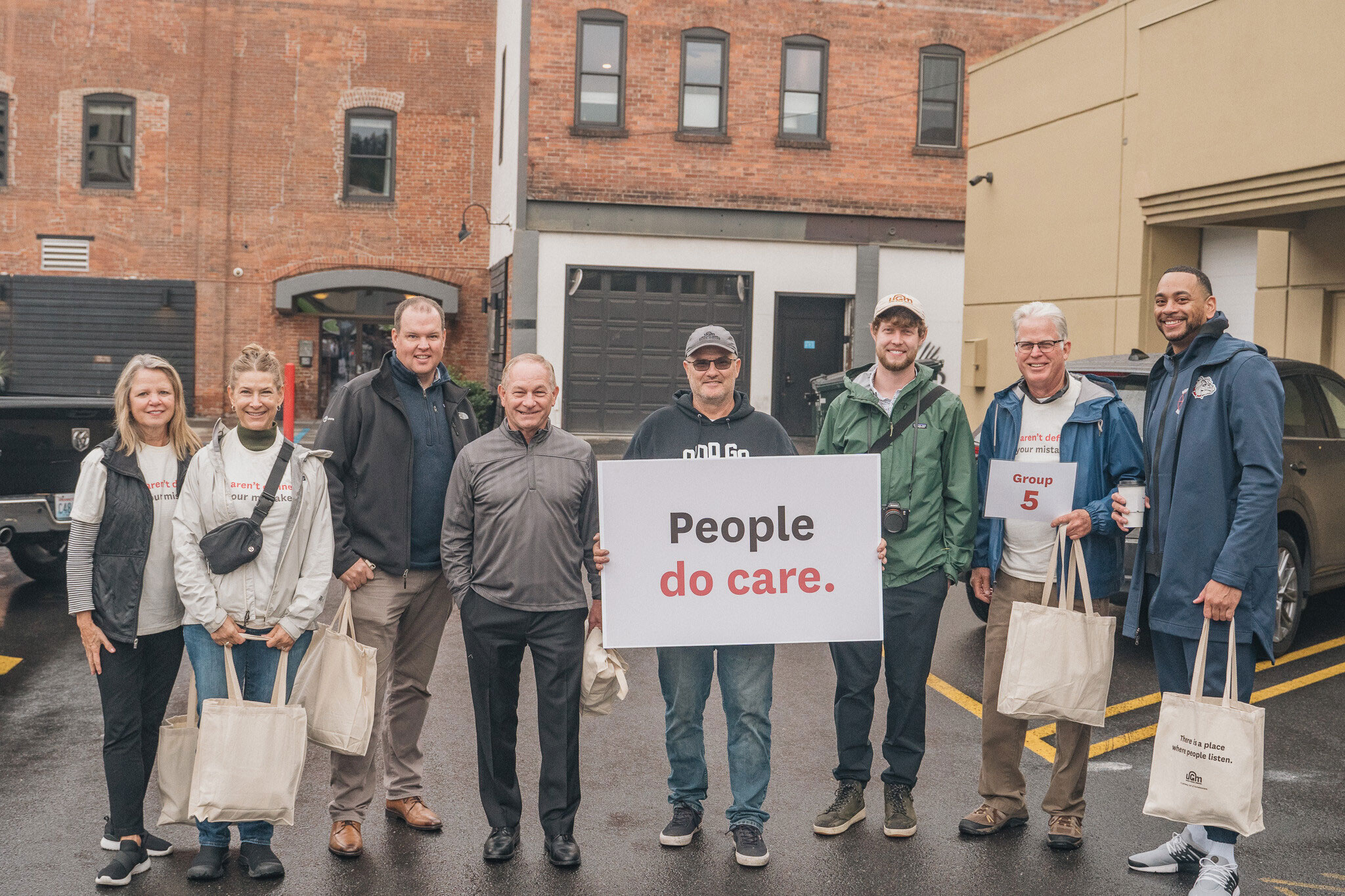
The Words of Hope Campaign successfully captured attention, strengthened trust in UGM’s approach, and highlighted its impact on the lives of those in recovery. The new direction allowed for a meaningful connection with the homeless community, donors, and financial planners, encouraging broad support for UGM’s mission and securing the critical funds needed to continue their work.
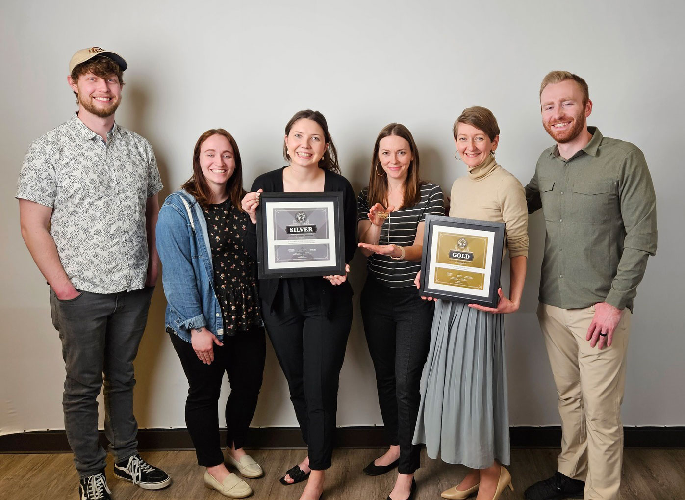
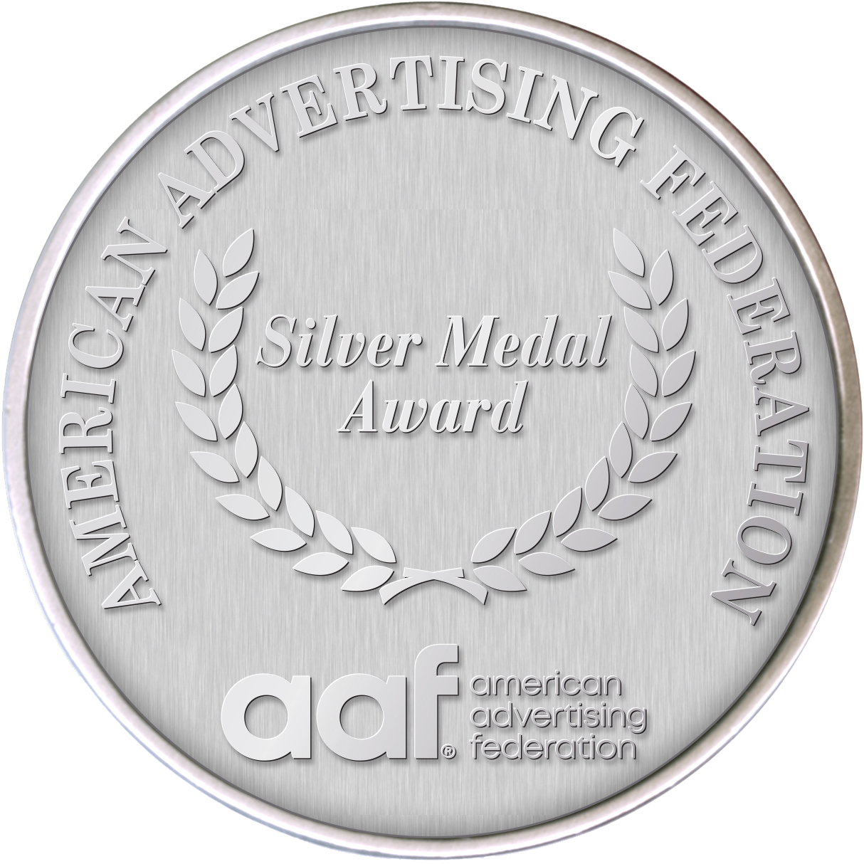
Silver Addy awarded at a state level for overal campaign design.
Director Jessica Morgan
Photographers Jonathan Jones, Marisa Flippen
Design Renee Cook
Writers Genevieve Gromlich, Emma Tucker, Leanne White
Videographer Jonathan Jones
Art Directors Jessica Morgan, Renee Cook
Web Design Jonathan Jones, Renee Cook

Contact

Phone: 509.768.1588
Email: klemmren@gmail.com
© Renee Cook 2024
Graphic Designer
