Brand identity & UX design
SPOKANE COUNTY LIBRARY DISTRICT (SCLD) IS MADE UP OF 10 LIBRARIES SERVING SPOKANE COUNTY AND AFFILIATED CITIES.
In partnership with Spokane County Library District (SCLD), I co-led a comprehensive rebranding initiative to modernize and unify its visual identity. This refresh aimed to keep SCLD relevant and fresh, setting it apart from other library systems while appealing to non-users by showcasing the library as a valuable and accessible service they might not have considered before. At the same time, the refresh sought to remind current patrons of SCLD’s established, trustworthy, and consistent presence, reinforcing their confidence in the library as a resource they can rely on for years to come. Beyond these primary goals, the rebranding effort also aimed to highlight SCLD’s services beyond traditional book lending, such as digital tools and community programs, ensuring that its full range of offerings was represented in its visual identity.
The target was to establish a distinct brand identity for the Spokane County Library District, allowing customers to easily differentiate it from the Spokane Public Library, which serves the city limits. The challenge was to create a unique logo and color scheme that would clearly distinguish the county district while avoiding confusion with the city library’s existing branding.
Planned deliverables
• New logo, color palette, fonts
• A refreshed visual presence online (with a new website coming eventually)
• New social media visual presence, using branded templates
• Current pieces updated to reflect new brand
• Updated brand guidelines
Role
Research
Brand development
Marketing materials
UX design
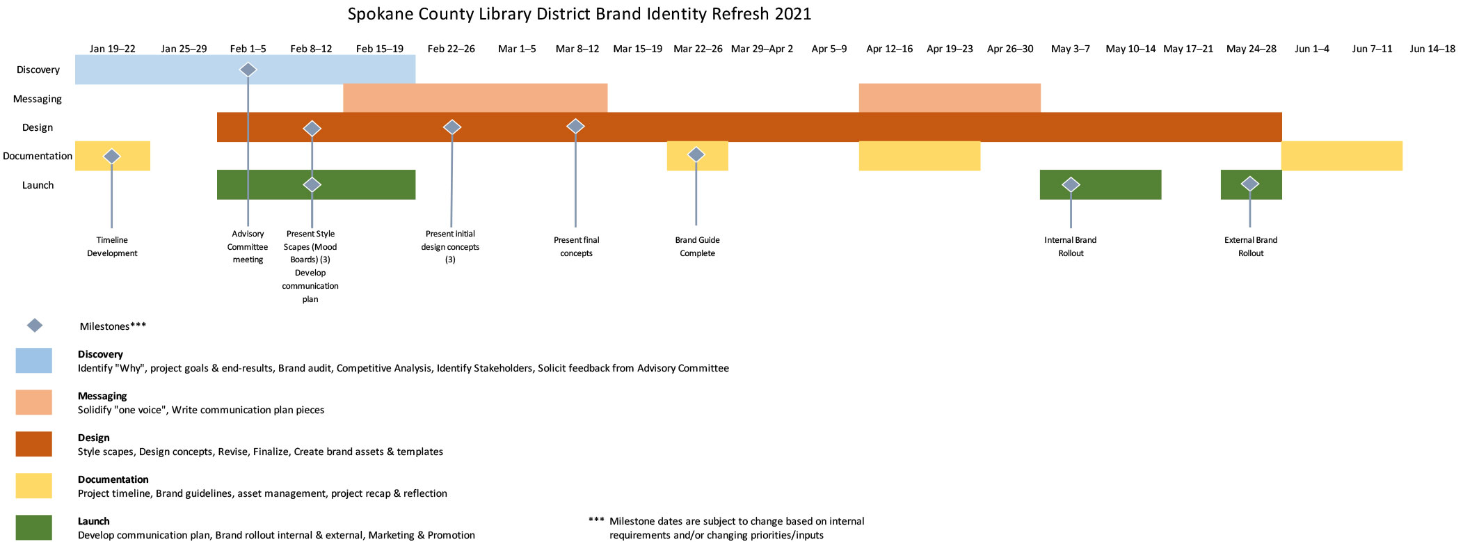
Brand Refresh Advisory Committee
The Brand Refresh Advisory Committee, consisting of six library staff members from different locations, was formed to guide the SCLD rebranding project. Their role was to inform, provide feedback, and identify customer pain points with the current brand during the discovery phase. They reviewed the work plan, timeline, and project goals, conducted a brand audit, and analyzed competitors. The committee gathered and integrated feedback from stakeholders throughout the process to ensure the refresh aligned with library goals and resonated with the audience.
Brand perception survey
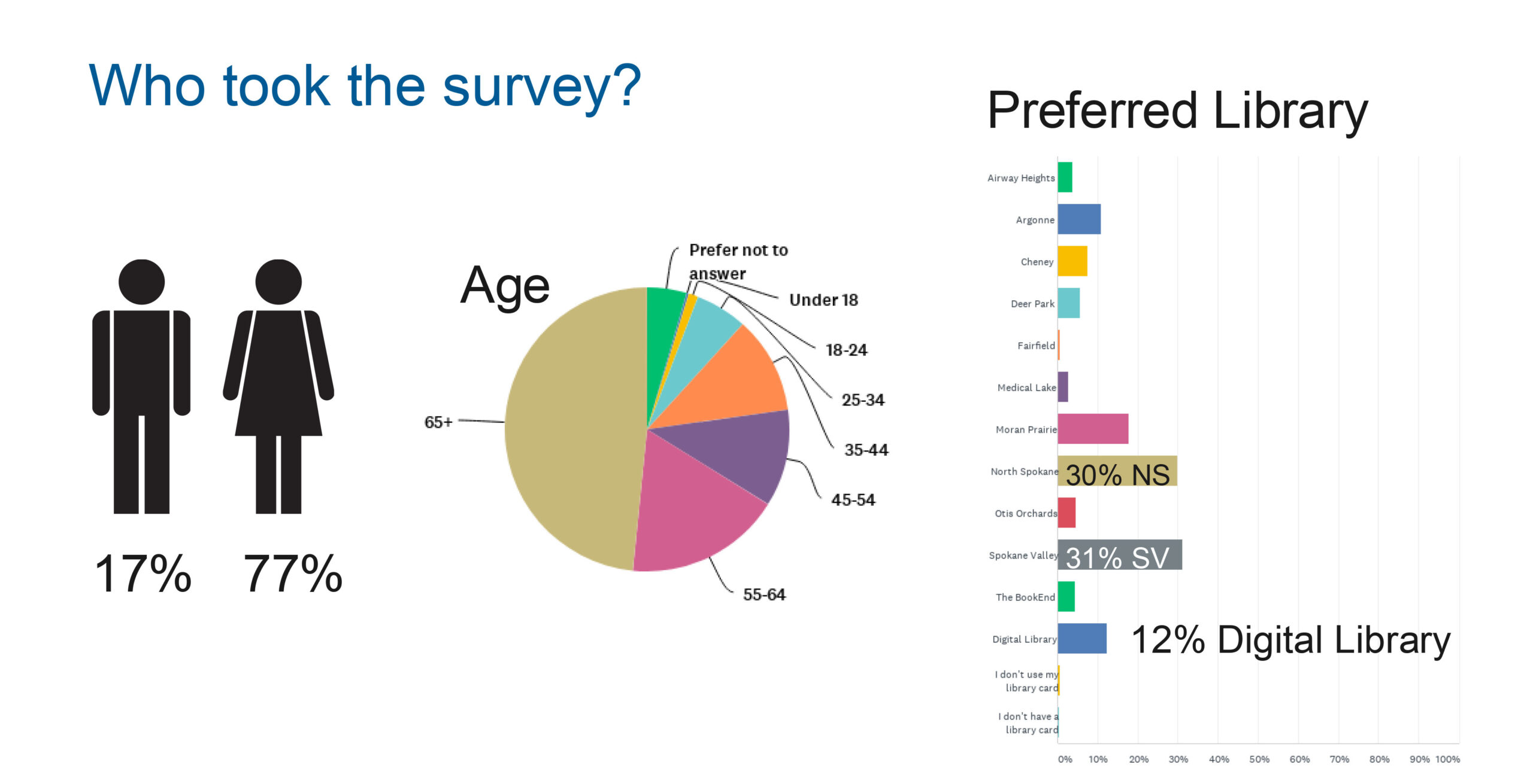
To begin research, we distributed a 27-question survey to the entire SCLD email list via SurveyMonkey. The survey aimed to gather insights specifically about the brand, with six optional demographic questions included at the end. The response was impressive, with 1,754 participants and an 88% completion rate, including the optional demographics section. Among the respondents, approximately 17% identified as male, 77% as female. Notably, nearly half of the respondents were aged 65 and older, providing valuable insights into a significant segment of our audience. This feedback played a crucial role in shaping the personas.
Key points about the survey:
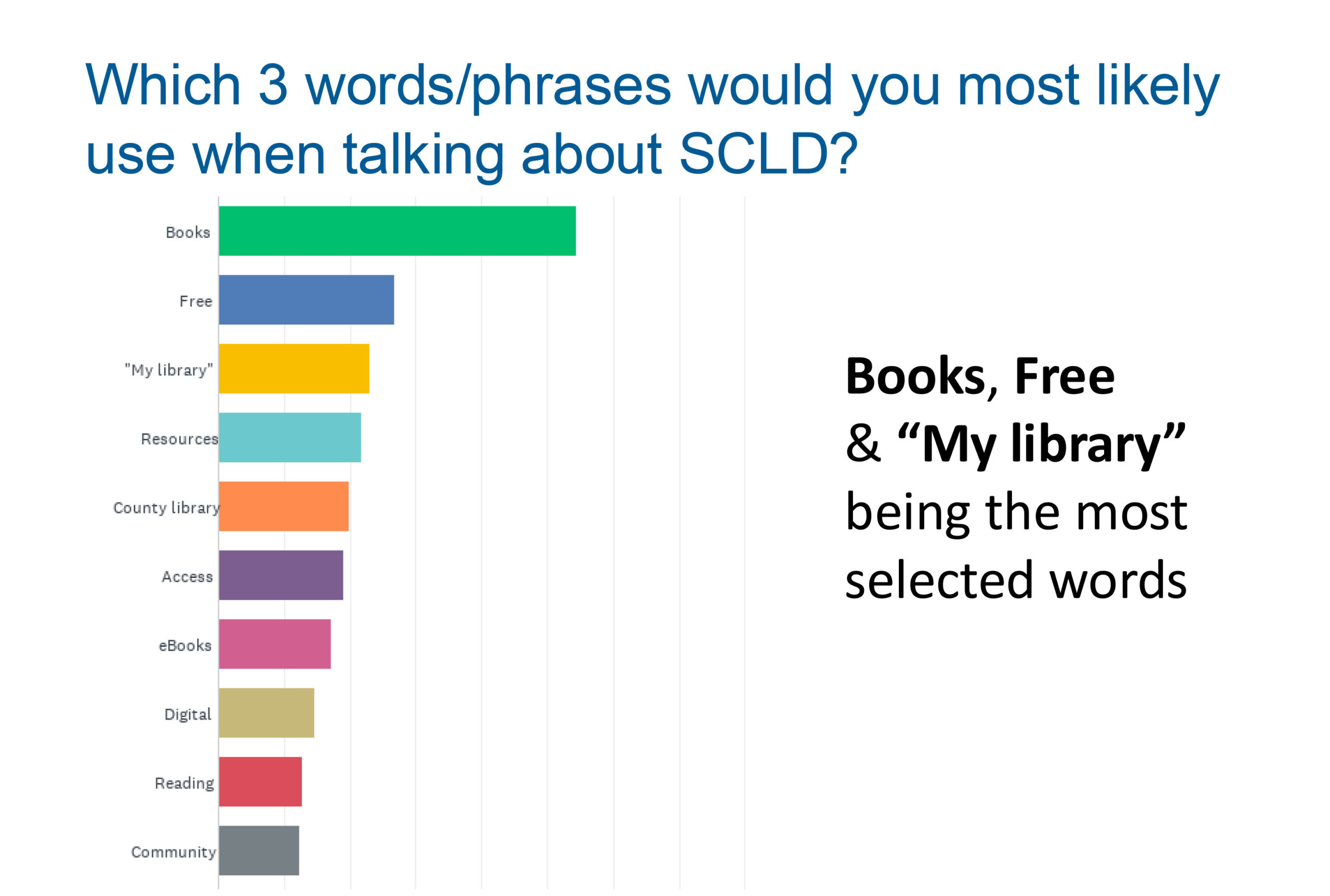
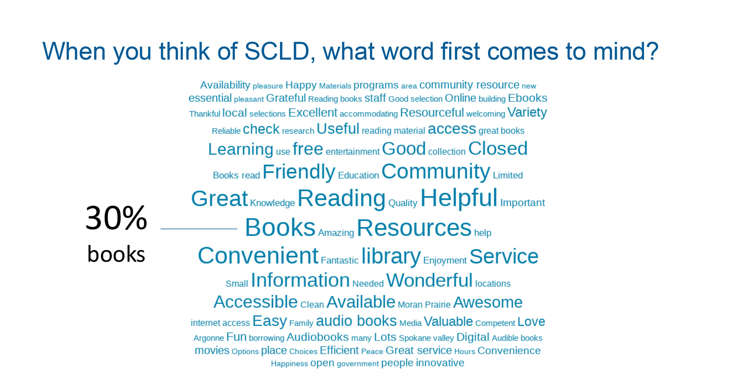
It targeted current customers—those who actively use and are familiar with SCLD. The most frequented locations among respondents are the Spokane Valley and North Spokane libraries, along with the digital library. Customers primarily associated SCLD with books and view it as a helpful service.
Personas
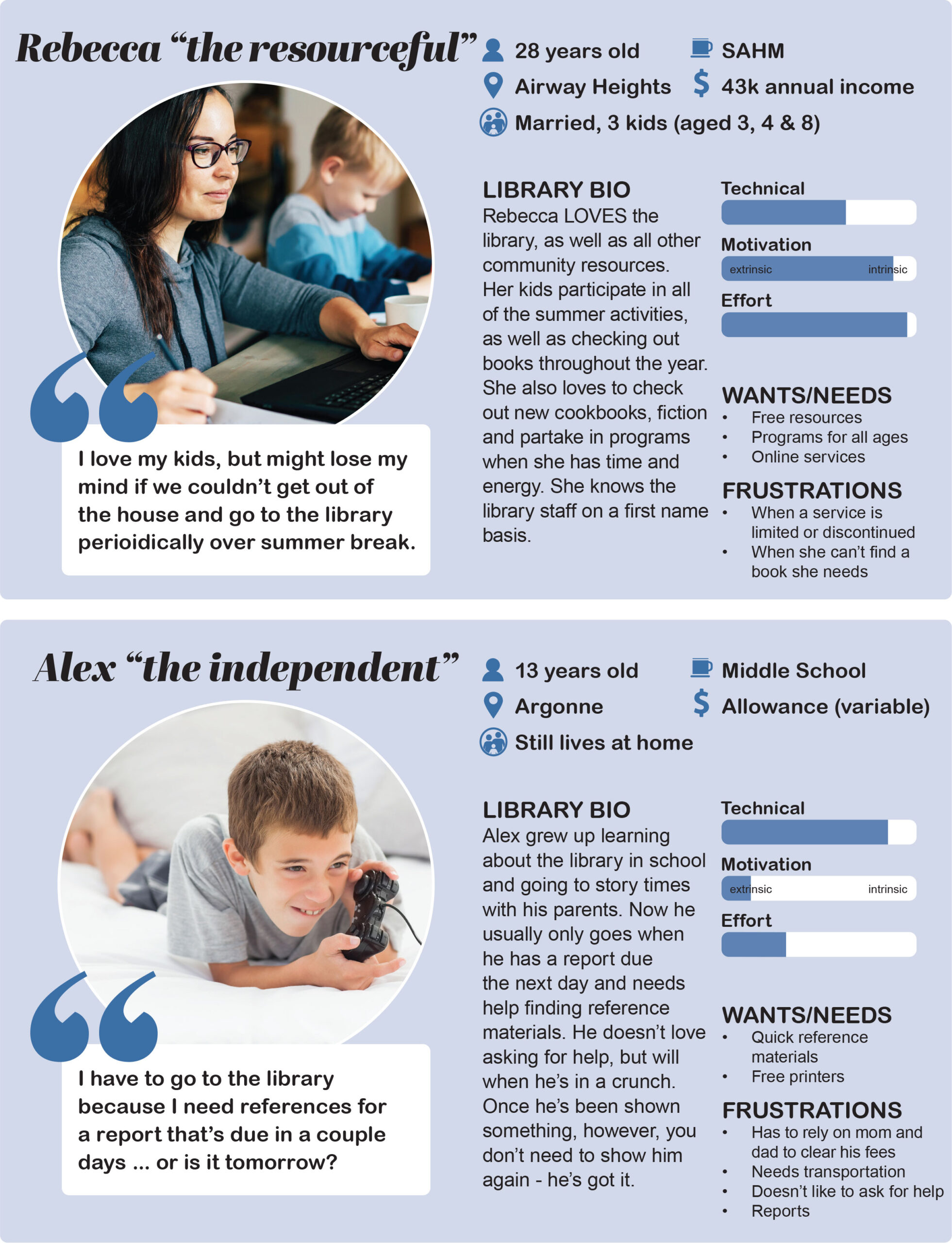
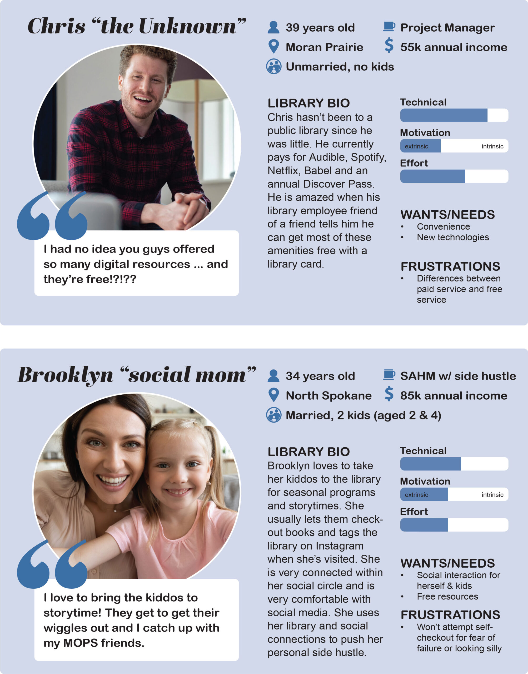
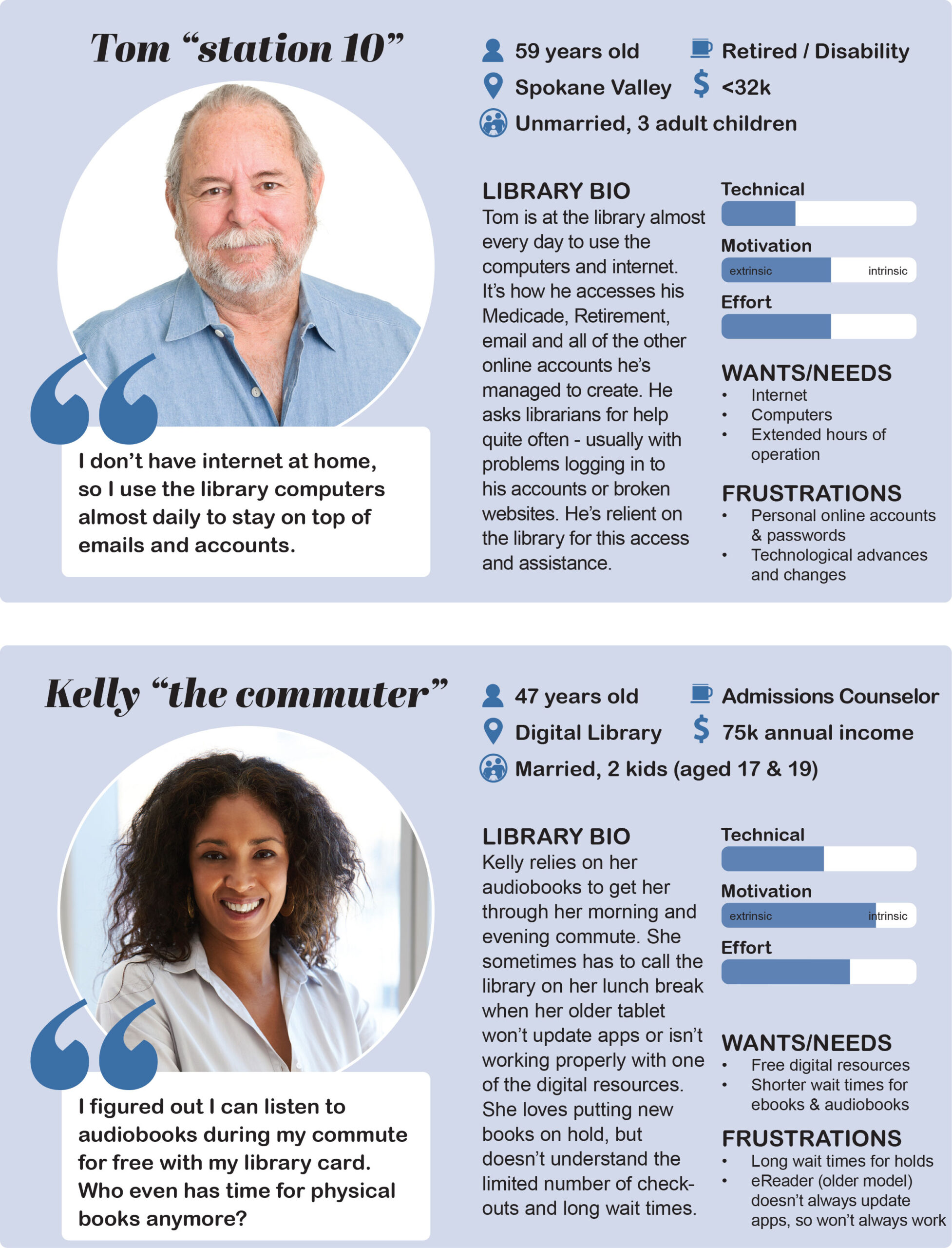
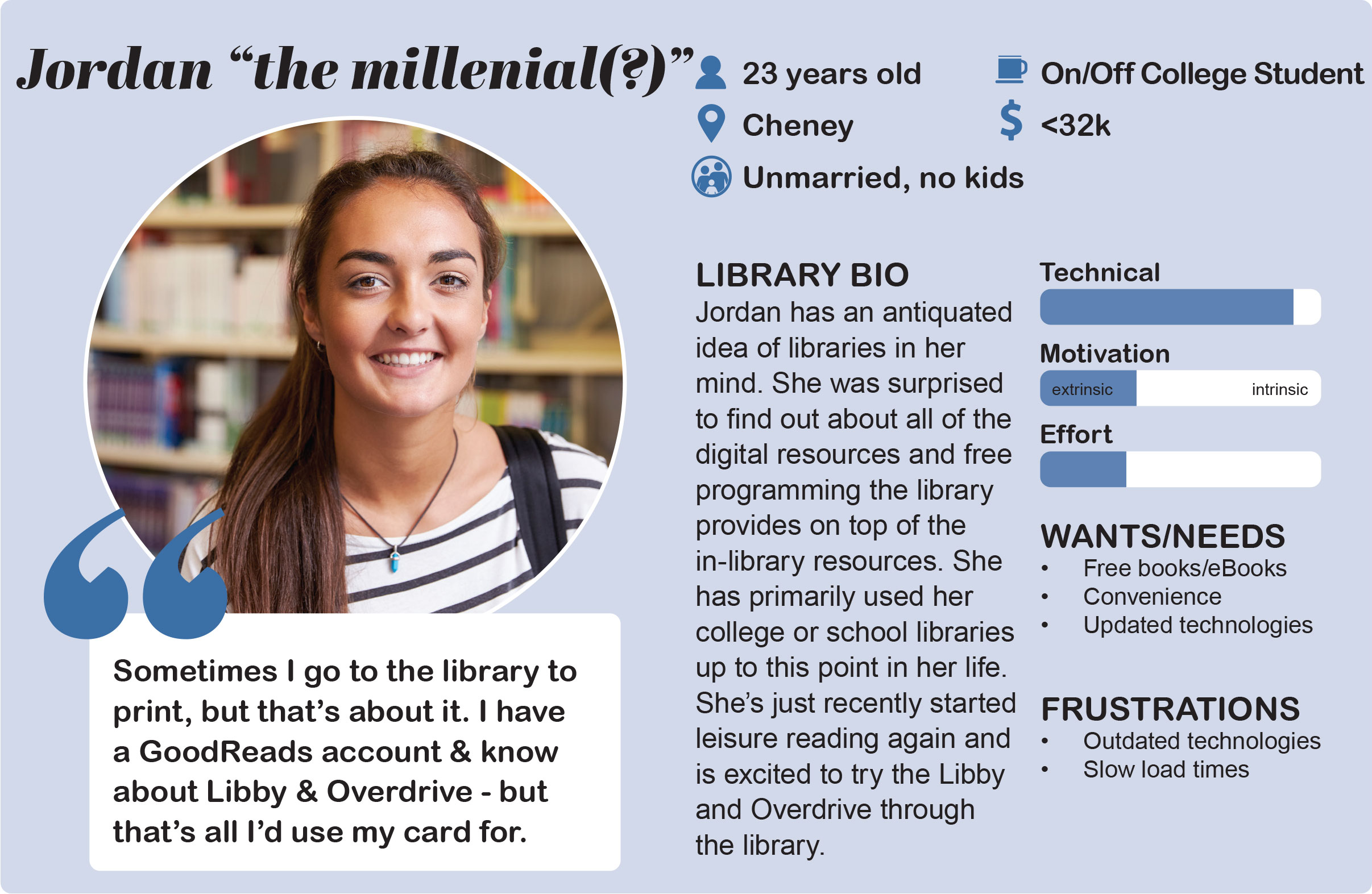
Before shaping the visual identity for the SCLD rebrand, understanding the audience was crucial. Creating personas became a key part of this process, informed by insights from the Brand Perception Survey. These data-driven personas captured motivations, frustrations, behaviors, and goals, helping us empathize with users and keep them central to every decision. By addressing their specific needs and challenges, we aimed to create a design that resonated with and served them effectively.
The survey revealed three primary user categories: Recreational, Resource, and Digital. Personas like Rebecca and Brooklyn represented recreational users, focusing on family programs and community events. Resource users, including Tom, Alex, and Lynn, depended on library tools like computers and quick references. Digital users like Kelly prioritized convenient access to online resources. Jordan blended all three categories, while Chris, representing the "unknown," had yet to engage deeply with the library. These personas provided a foundation for tailoring the rebrand to diverse user needs.
Research
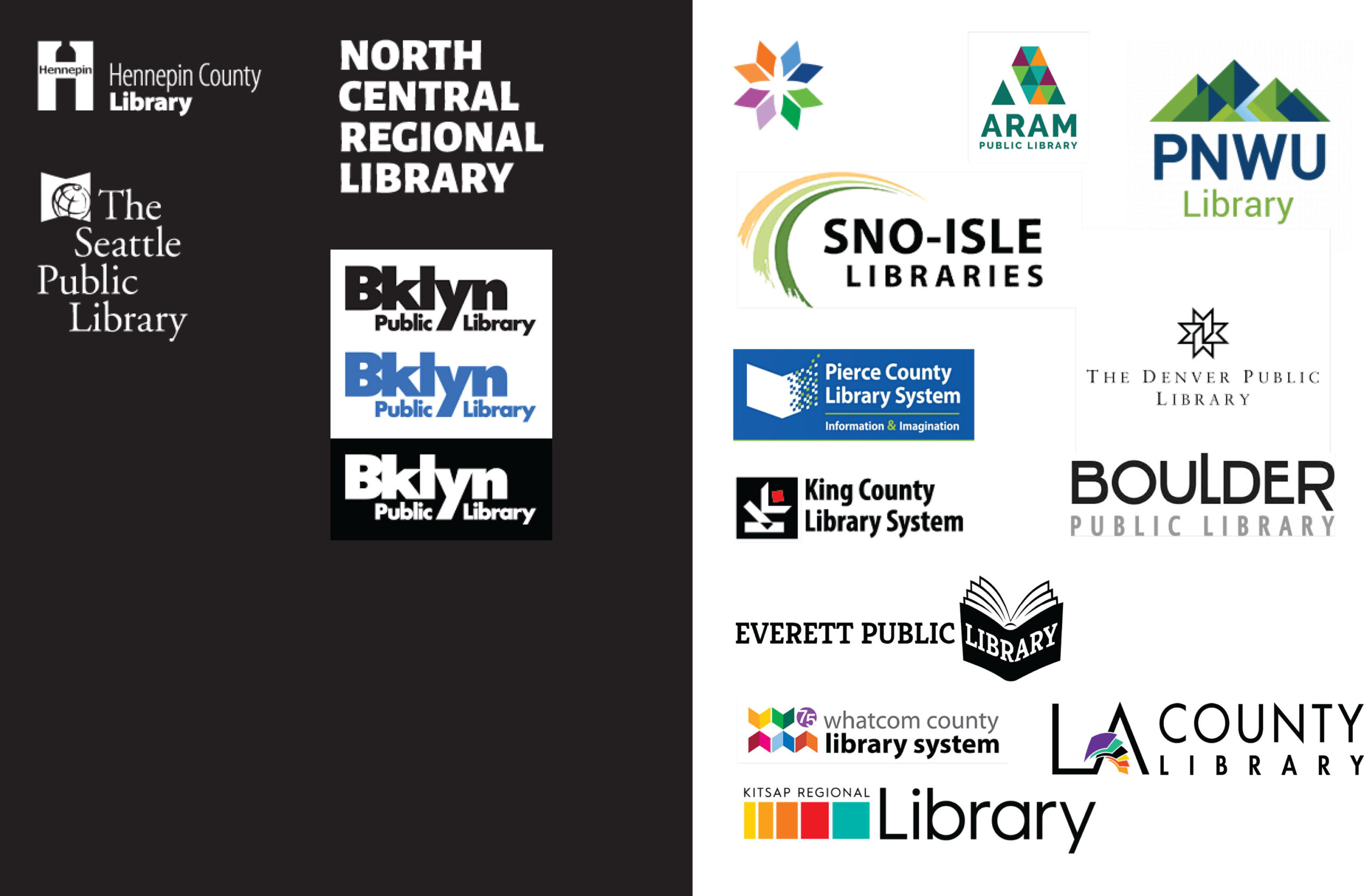
A key part of the user research involved a close examination of the Spokane County Library District’s existing brand, assessing what elements resonated with stakeholders and identifying areas for improvement. This included evaluating visual elements we liked or disliked and exploring libraries and other organizations that excelled in brand design to gain inspiration. Additionally, the research would examine brands that resonate with our customers to better understand SCLD’s aspirational identity. Questions guiding this research included “Who do we want to be?” and “What branding elements engage and attract our users?”
Logo history
The Spokane County Library District (SCLD) logo has evolved over time from a detailed design to a simpler, modern look with a central figure and open book. This progression reflects SCLD’s shift towards a clearer, more contemporary representation of knowledge and accessibility.

Preliminary stylescapes
Stylescapes are visual tools that combine images, colors, typography, and design elements to explore a project's potential look and feel. For the SCLD rebrand, three distinct stylescapes were created to gauge the Brand Refresh Advisory Committee’s preferences, helping identify the direction for logo and color development.
STYLESCAPE 1
Creative, Positive, Inspired
This stylescape is meant to leave you feeling inspired, bright and positive. A color palette to set ourselves apart by using a classic black and white palette with splashes of vibrant yellow, curious blue and atomic tangerine. A modern, clean and bold approach to signage, type and icons help round-out this stylescape.

STYLESCAPE 2
Energy, Optimism, Wisdom
This stylescape radiates energy, optimism and wisdom. Blue, which signifies stability and trustworthiness is the main color in this monochromatic scheme. The vibrant secondary colors; cinnabar, carrot orange and shadow green would help accentuate calls to action and wayfinding signage. Sturdy, geometric textures and patterns help support the energy and wisdom that surrounds the library. Clean, sans serif type, bold logo forms and strong icons keep this visual style effective and straightforward.

STYLESCAPE 3
Growth, Inviting, Harmony
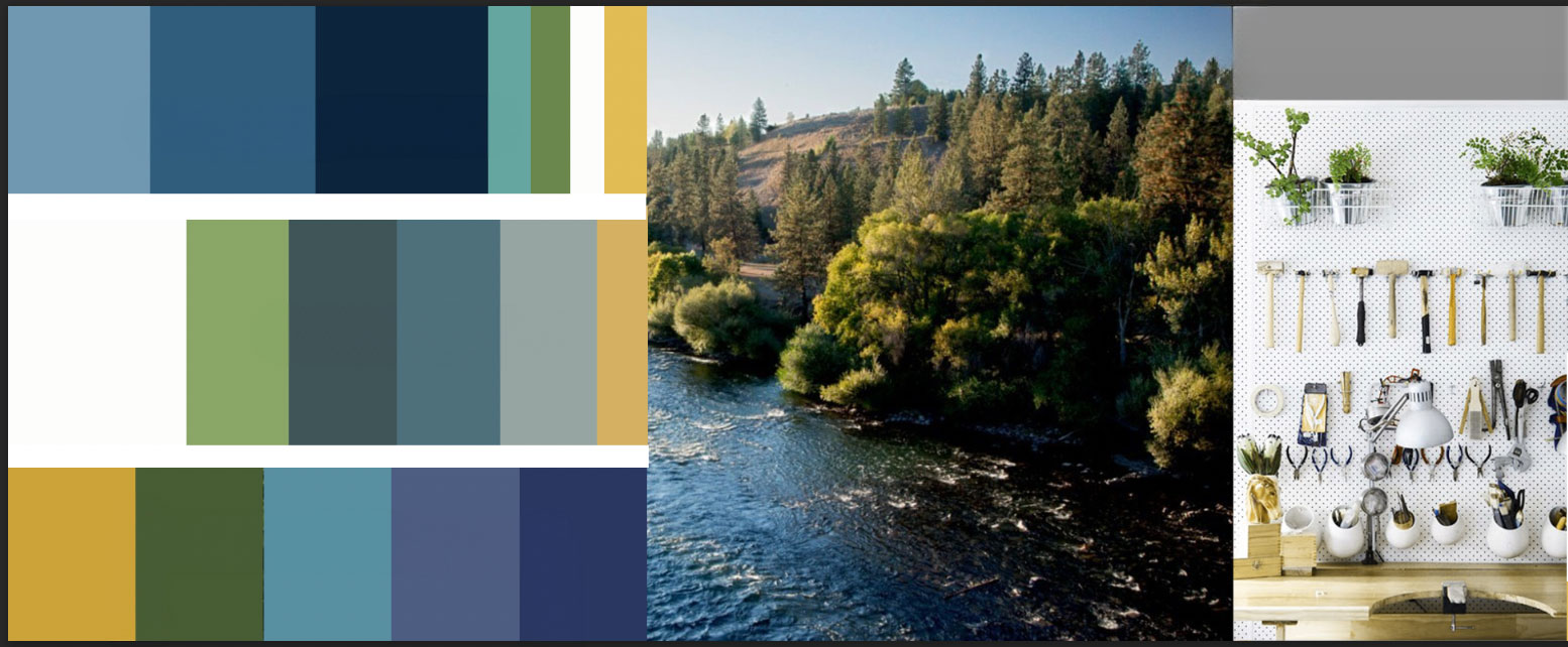
Inspired by our natural surroundings, this final stylescape, “growth, inviting, harmony” is a calm, clean visual representation of our place in this community. The primary colors of this scheme are charcoal and almost white with secondary colors of chelsea cucumber, casal, tower gray and fallow. This scheme is meant to feel fresh, yet familiar. Classic serif and sans serif fonts along with natural imagery, textures and handmade elements support the inviting and accessible feel of the this stylescape and our libraries.
This approach was the committee's preferred option, though they had several points of feedback:
• Concerns that the teal colors might feel outdated quickly
• Disliked the use of a serif font
• Noted that the "teal colors" evoked memories of the Kite logo era
• Felt there were too many colors, diverging from their initial preference for a monochromatic palette
• Questioned whether the overall tone was too subdued

Revised stylescapes
STYLESCAPE 3.1
Based on the committee’s preferred stylescape and feedback, we shifted toward blues inspired by the Spokane River, moving away from teals, and brightened the colors to address concerns about the palette feeling "too subdued."
While many appreciated these adjustments, the colors still lacked cohesion, felt less monochromatic, and strayed too far from the calming and peaceful essence of the original mood board.

STYLESCAPE 3.2
For this stylescape revision, we selected more subdued blues inspired by the Spokane River (as seen in the bottom-left photo), opting for a monochromatic palette with green undertones to echo the teal hues from the original mood board. The green and yellow were directly carried over from the original mood board. While the addition of lilac was considered, we decided against it. Since Spokane Public Library incorporates lilac in its branding, and the color is often associated with the City of Spokane, avoiding lilac allows us to better represent the entire county and differentiate SCLD’s identity.

Logo creation
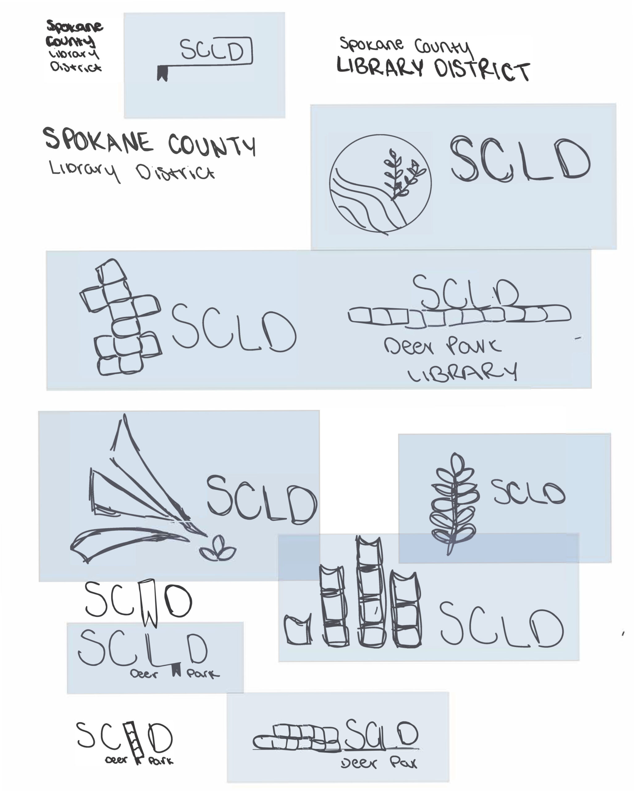
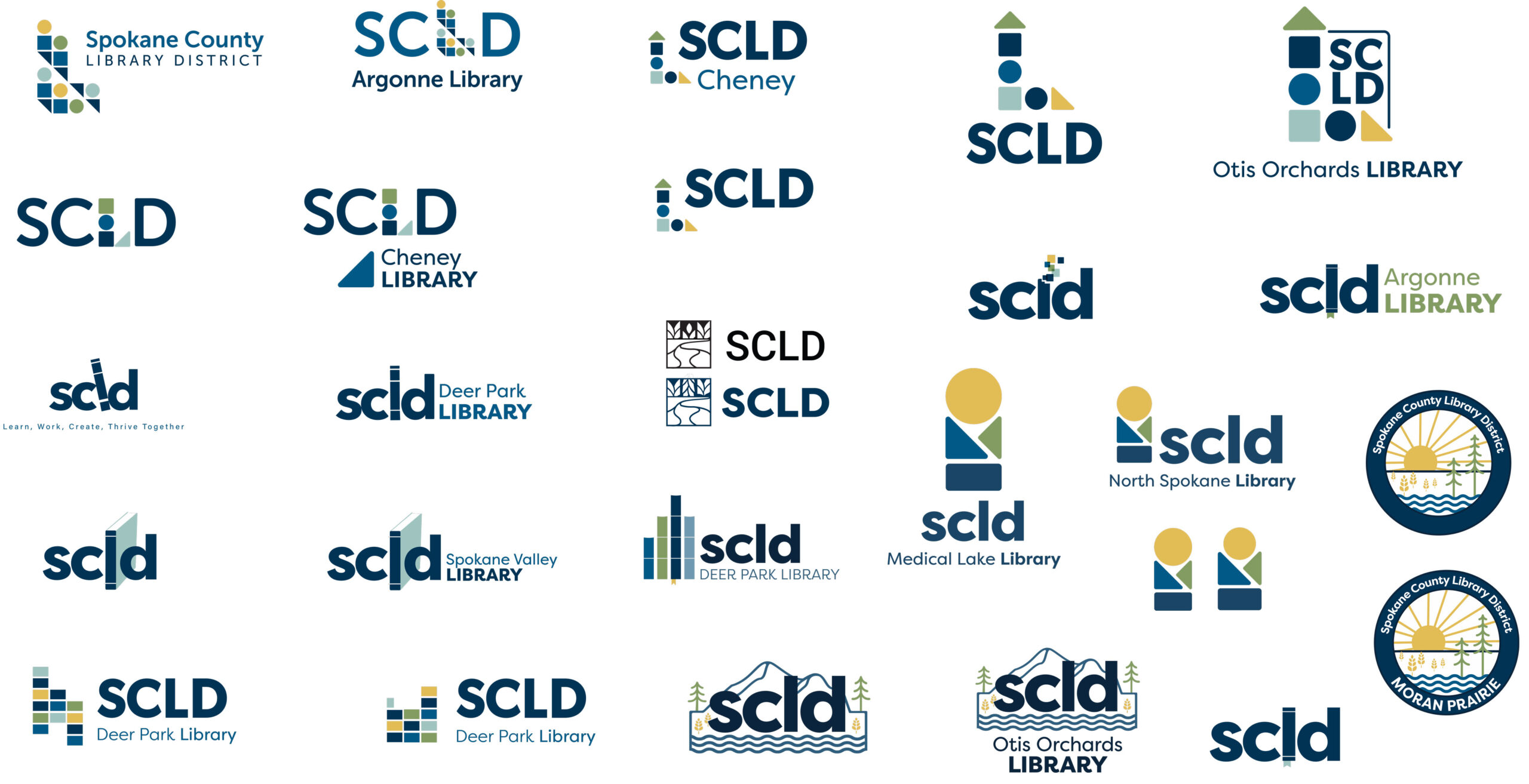
The logo ideation process began with hand-drawn sketches to explore various concepts, experimenting with symbols like open books and abstract figures to convey knowledge, community, landscape, and accessibility.
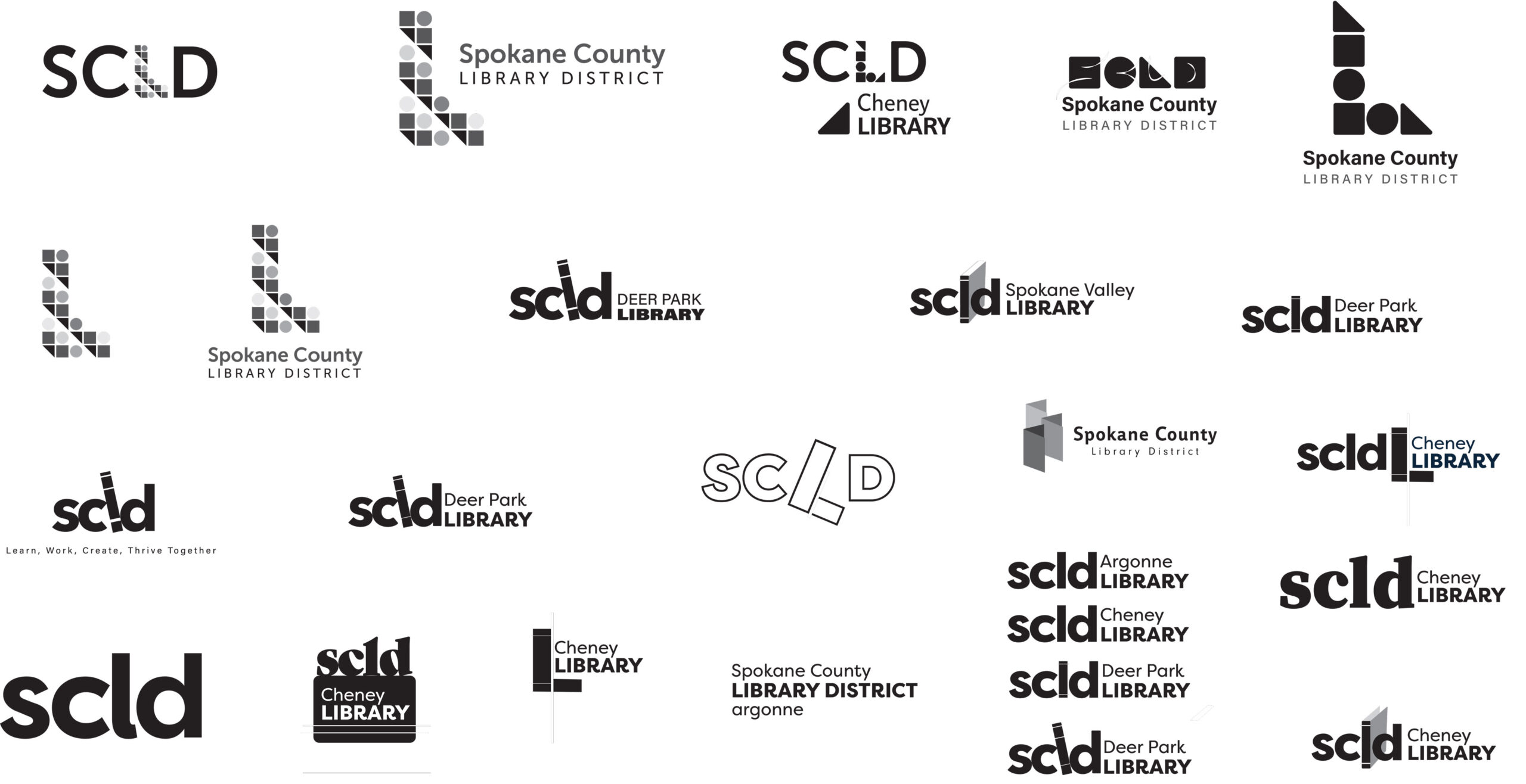
After the initial logo concepts were sketched by hand, the design process progressed to creating clean, black-and-white vector versions. This allowed us to see how the logo would look professionally, with precise adjustments and scalability.
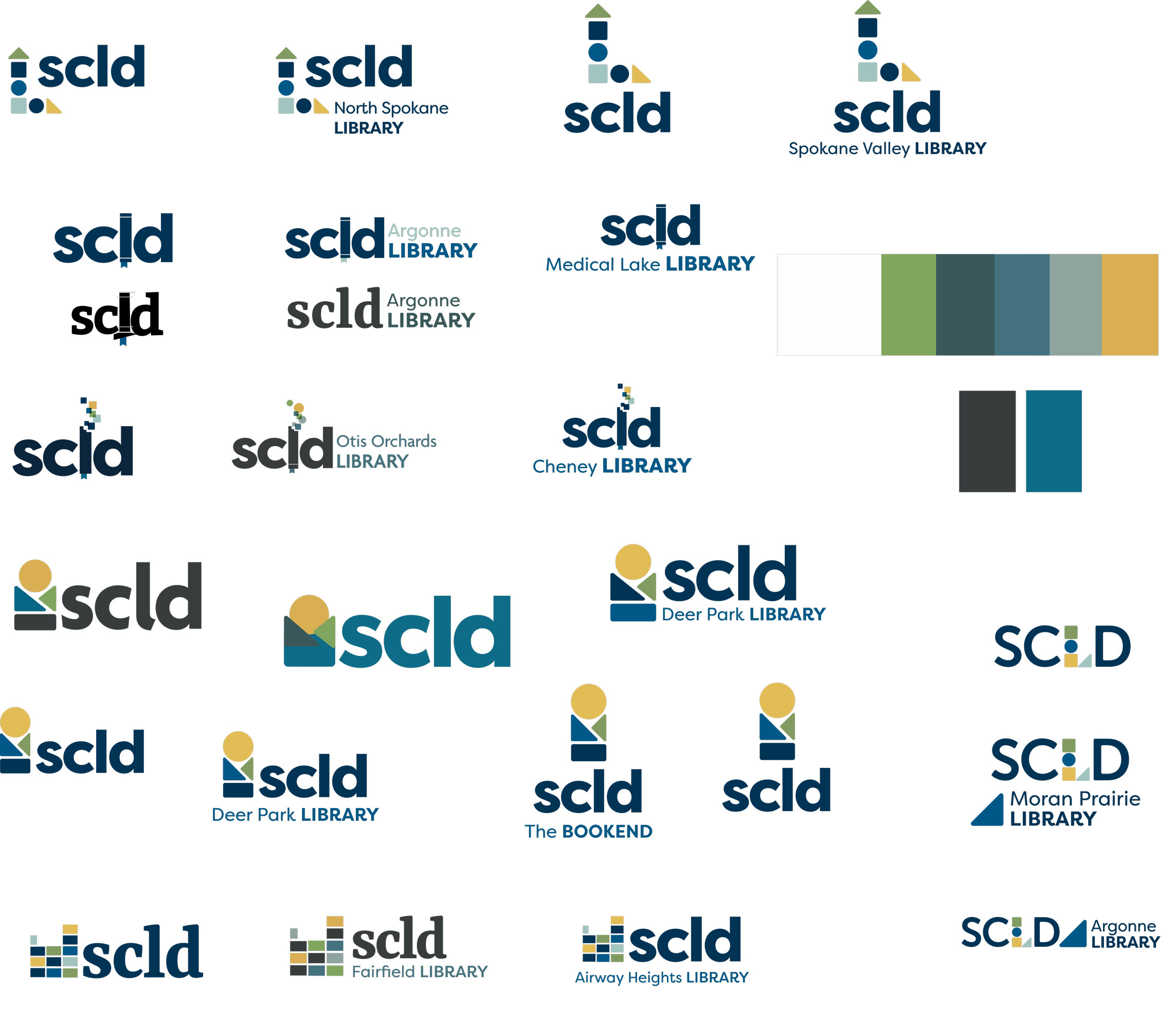
Then we began experimenting with colors, focusing on blues and greens inspired by nature, guided by feedback from the brand committee, research insights, and stylescape explorations. The colors brought the logos to life, helping us quickly identify which designs to pursue and which to eliminate.
Impact & Outcomes
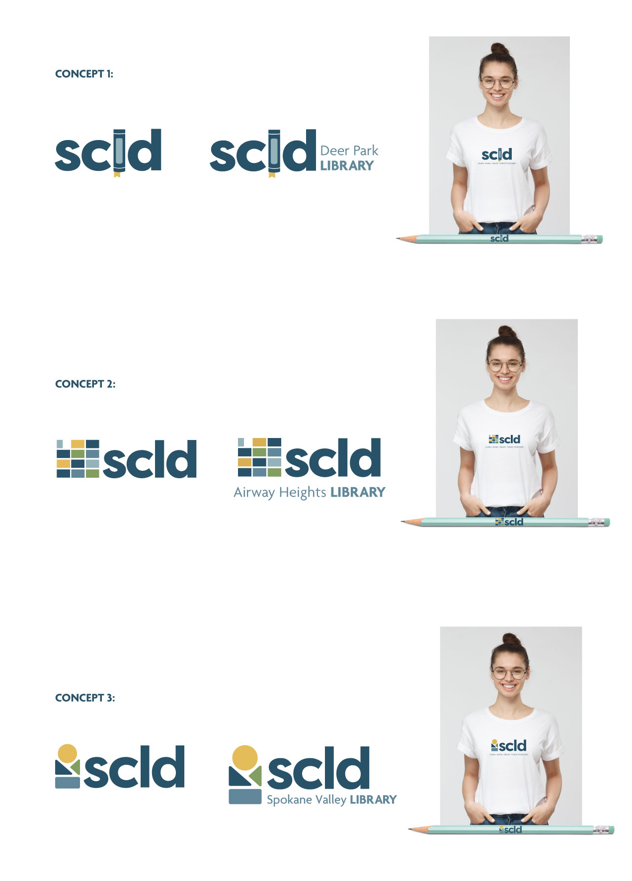
After multiple iterations and feedback from the Brand Refresh Advisory Committee and leadership, we finalized three logo concepts, accompanied by mockups on items such as a t-shirt and pencil.
Logo Concept 1:
SCLD Book 'L'
We enhanced the book’s details, added more perspective to the spine, and brightened the bookmark based on feedback. We experimented with different fonts but didn't find one that was preferred. We also updated the library font for more consistency, while still maintaining a fun, decorative style.
Logo Concept 2:
SCLD Building Blocks Representing Each Library
Given feedback that the Spokane County shape was unclear, we simplified the design with sturdy blocks representing libraries and diverse communities. The concept remains open to interpretation, reflecting the versatility of our libraries.
Logo Concept 3:
Building Blocks Representing the PNW, a Person Reading or Using a Computer, Diverse Populations
We adjusted the block height to align with the letters and refined the color palette. While we briefly experimented with compressing the blocks for a nature scene, we kept the original design.
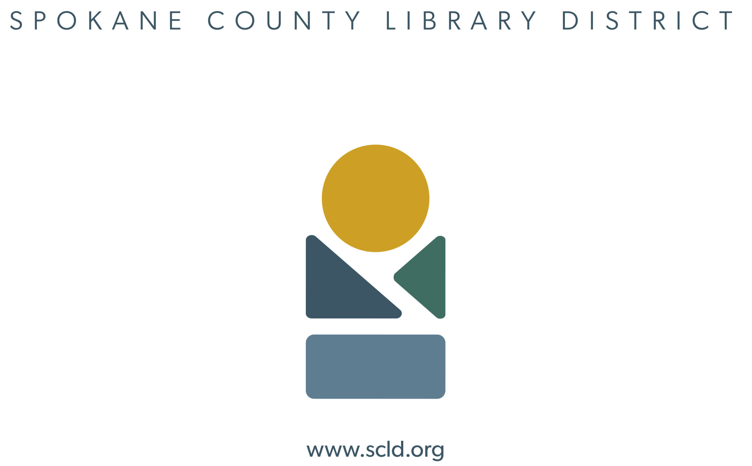
Final logo & deliverables

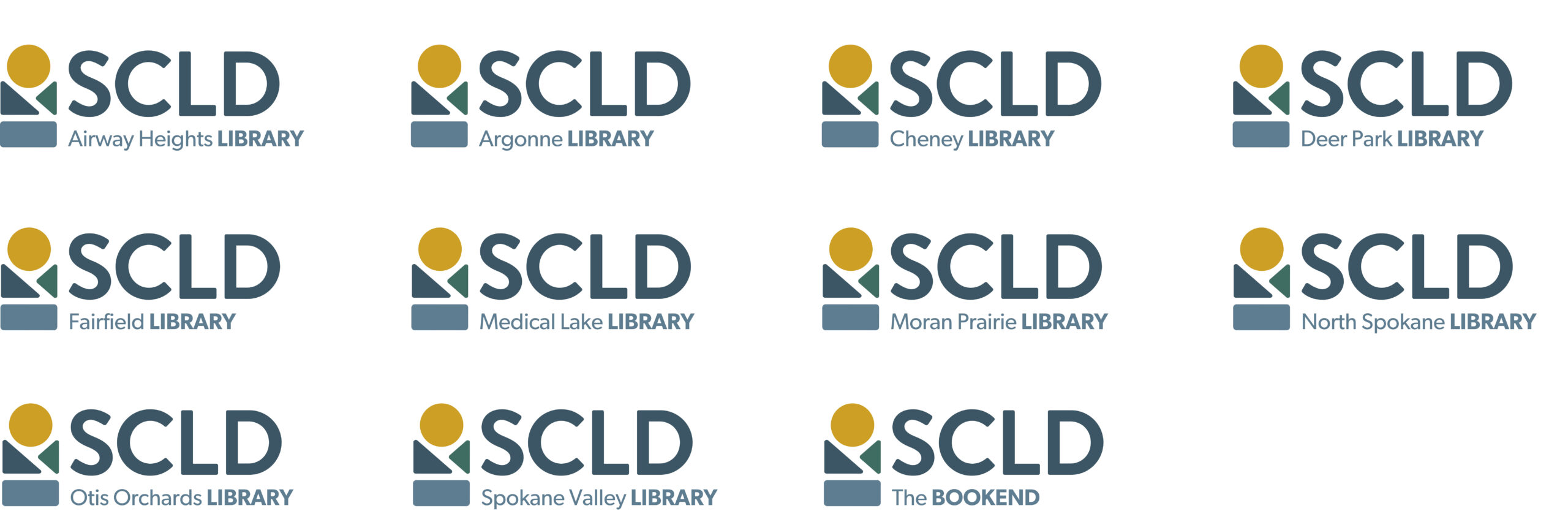
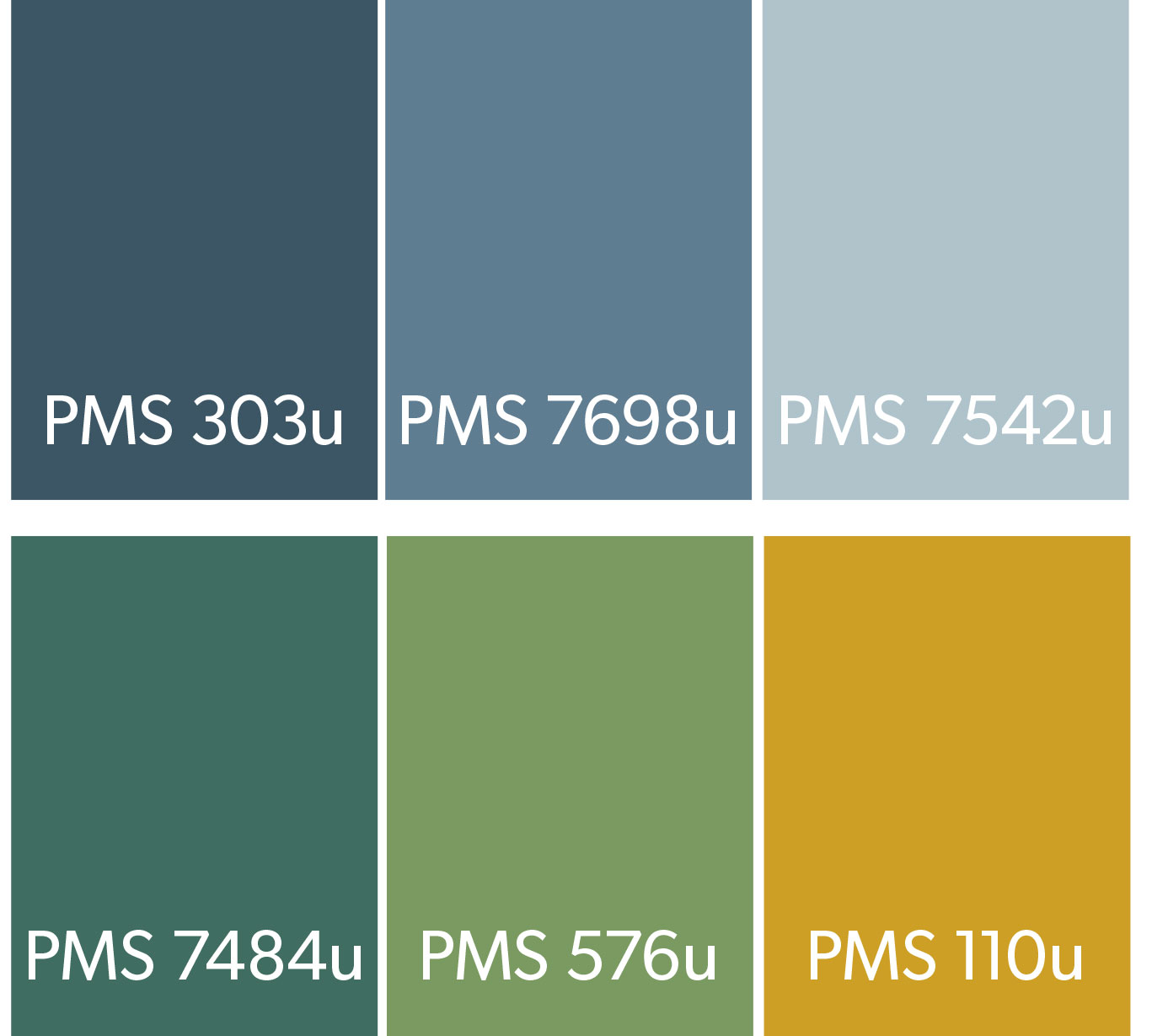
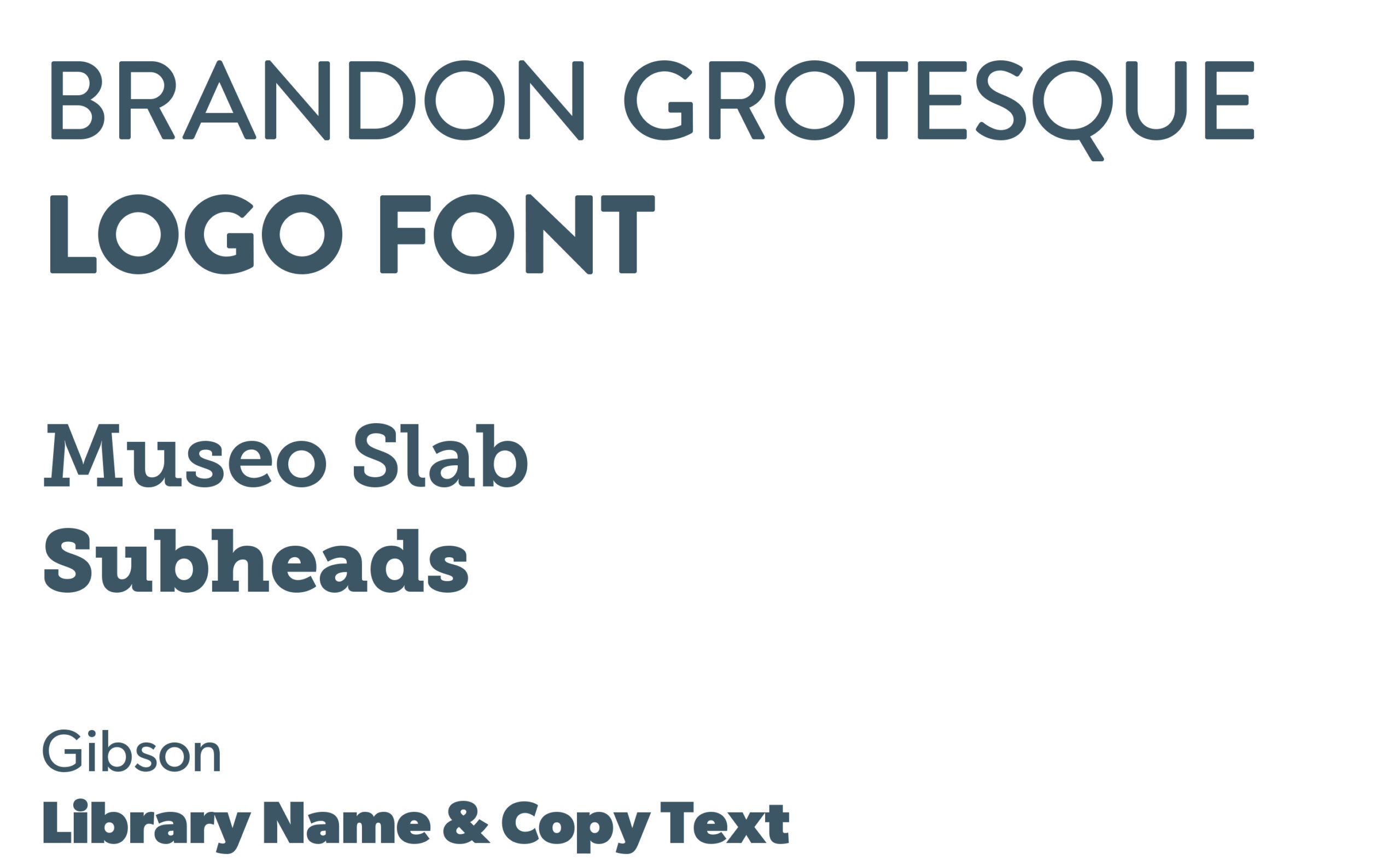


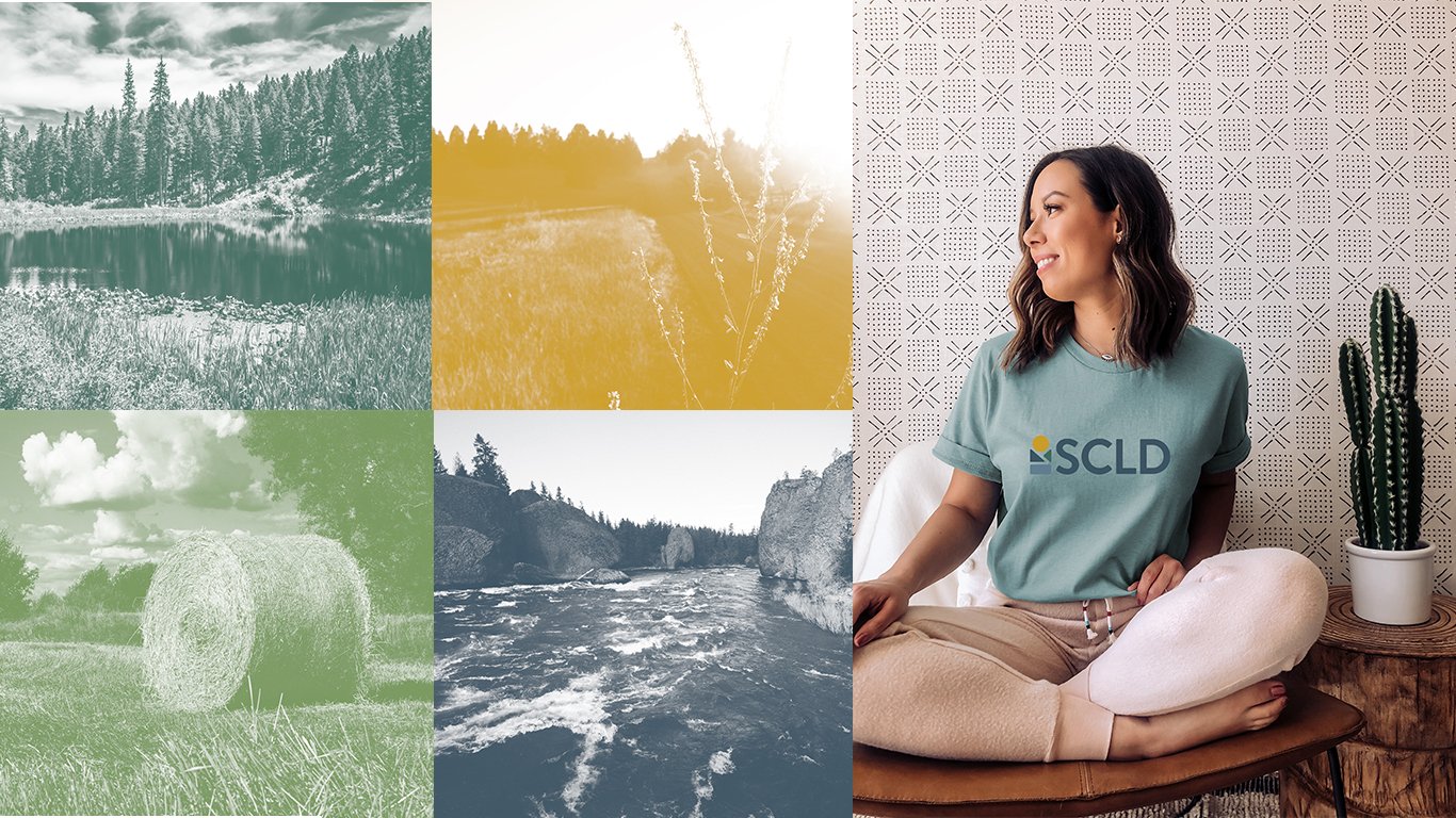
Impact & Outcomes
The refreshed brand successfully achieved SCLD’s objectives, positioning the library as a modern, engaging, and community-centered resource. The rebranding has helped SCLD enhance its visibility, reinforce its reputation as a trusted library system, and appeal to a broader audience, while maintaining a friendly, accessible identity. With new brand guidelines in place, SCLD’s communications across digital, print, and physical spaces now present a unified, impactful look that reflects its mission and values.
Lead Design Amanda Flanery
Design Renee Cook
Brand Advisory Committee Sara Hanson, Katie Hannan, Stacy Loberg, Amy Fair, Brian Vander Veen, Kris Barnes
Contact

Phone: 509.768.1588
Email: klemmren@gmail.com
© Renee Cook 2024
Graphic Designer
